Showing posts with label 1953-54 Topps World On Wheels. Show all posts

Saturday, July 10, 2021

American-International Intrigue

World On Wheels was a classic Topps Giant Size set, issued in at least two and possibly four series.  The low numbers span from #1-160 and appear to have been issued in two distinct series, generally thought to be 80 cards in number apiece. Ten high numbers follow and while difficult, they are do-able compared to the "high-high" numbers spanning #171-180, which are extremely tough and possibly came out, either in whole or in part, after the rest of the issue had been put to bed.

The method of distribution of the last ten cards has never been fully determined so far as I am aware. A handful of wrappers exist that indicate 1955 models were included, so that makes sense but almost all end at 1954, like so:

(courtesy Huggins & Scott)

I'll leave them out of the mix here but there are at least two varieties of nickel wrappers as well that span 1896-1954.  They are close to each other in appearance but not quite the same. Here is a "55" one cent wrapper:

(courtesy Lonnie Cummins)

I can't say I've seen a nickel wrap with 1955 on it but that doesn't mean they weren't issued.

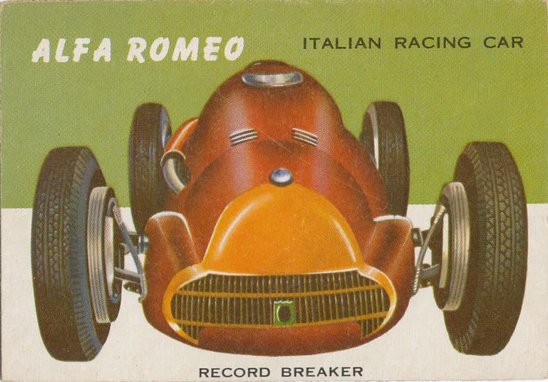
Paging through my set the other day, I noticed the subject matter of the four cards that were not 1955 models in the"high-highs", which we will get back to shortly:

171 Pontiac Strato-Star
172 Chevrolet Biscayne
173 Buick Wildcat III
174 Messerschmitt

The Messerschmitt is the only foreign car in the "high-highs", all the others were US models. We'll also get back to that tidbit momentarily.

These last ten nosebleeders can be found with red backs (matching the first 170 cards), or blue, which is unique to the last ten subjects. The use of blue ink is a mystery and it's worth pointing out the red or blue color bars on the reverses of these ten in either color do not extend to both edges of the card, they fall slightly short, which is not always noticeable due to miscuts, which plague these last ten cards. The color blocks on the front also fall short of their side edge border, which are also sometimes noticeable due to miscuts but seem to have been designed this way. Allowing for the blue ink examples, none of the earlier 170 cards in this set exhibit these characteristics. 

In additon, the color of the red bars and secondary red coloring in the cartoon background on the backs of the "high-highs"matches the color of the red bars on the lower numbers while the blue seems to match the primary and secondary ink colors on the backs of Topps 1955 All American Football cards. Yup.

Here, check it out.  Here are a high-high front followed by a low number front:


Note how the left yellow border of the Nash does not bleed into the left edge of the card. The backs are like so:


The Roadster is on dingier stock than the Nash and the colors are a little muted but hey are the same reds.  Now here is a Caddy matched with an All American Football player:

Once again, the left border of the obverse color block does not have a full bleed. Now for the backs:

Note the Eldorado's blue color bar does not bleed to either edge!  We have matching blues on these two backs to boot.

So I got to thinking a little and am wondering of the "high-highs" were, in addition to a limited appearance in the "55" wrappers,  partially distributed at the New York International Auto Show, which was held every year back then at Madison Square Garden.  As near as I can tell the event was usually staged back then at the end of March and.or beginning of April.  It kind of makes sense-maybe Topps was a sponsor or just got a contract to print the cards. Maybe they just took advantage and issued a limited release in the NYC metro area.  

The International Auto Show was a major event in New York City and society was only just entering a period where such things started to lose their luster to TV, so it's possible but more evidence would be needed.  Other than the Messerschmitt, the three concept cars (Strato-Star, Biscayne, Wildcat III) all were featured at the 1955 event so I have to think there was some kind of intentional tie-in to the show by Topps.

What I really need is a program from that event to see if there is any reference to Topps.  I'd also love to know how the All American Football set came to use the same reverse color scheme as I doubt they were printed at the same time as the "high-highs" or in time for a spring release (which would be quite odd).  It's worth noting however, that the All American Football set is complete at 100 subjects while the press sheets were comprised of 110 cards.  Also worth noting is Richard Gelman has told me sometimes Topps would use an extra row on a sheet to print something separately.  However, this does not in any way explain the red backed high-highs.


Saturday, June 20, 2015

Hit The Road Stack

I've sung the praises of the 1953-54 Topps World On Wheels set before so when I was browsing the Heritage Auctions website the other day I was pleasantly surprised by a small stack of original art from the set.  Twenty four subjects were saved from the bowels of Bush Terminal at some point, probably before the 1989 Topps Guernsey's auction of original Topps artwork as my attempts to match these 24 with the 148 offered in 1989 didn't seem to match up. It's a little hard to tell with the antique auto subjects though, which make up the majority of the Heritage offering but if there are truly no duplicated subjects, then 172 of the 180 subjects have surviving artwork that's been identified.

The Guernsey catalog has a brief summary of the artwork and indicates it was all original illustration.  It's all uniformly outstanding:


Like I said, there are a lot of antique autos, one of which (fourth down on left) looks like the background color block has been inserted.  It hasn't though, as the actual card shows:


I like the lonely little VW Bug below:


None of this artwork solves the mystery of the "high high numbers" in the set, running from nos. 171-180 and which are of a slightly different composition than the previously 170 cards. The distribution method of these last 10 cards is also a bit of a mystery, as is the fact they can be found with red or blue backs, when all 170 that came before were red.

Friday, October 7, 2011

The Long And Short Of It

I took a hard look at some data on the 1953-54 World On Wheels set recently to see what kind of patterns might emerge in my quest to determine how the two very short series of high numbers were distributed.  The most obvious pattern is that the first 80 cards are locked into a repeating series of eight cards based upon the color of the information box on the obverse.  This would follow a precedent set by the 1953 Topps cards, which were grouped by their obverse color blocks on the press sheets.  As there are no uncut WOW sheets that I am aware of, the 53's will have to serve to illustrate the principle:


It would appear that it was preferable, at the time, to group large blocks of color together, even if it meant the backs would have to be coordinated with the fronts and half would have to be printed upside down:


The next year, Topps would print the 54's in a way that I think illustrates how the WOW sheets would have been composed:


Notice how the predominant pattern is grouping of the background colors into clusters of eight; World On Wheels first 80 cards follow this type of grouping as well.  To refresh your memory, here are the first 8 cards in the set:


In addition the first eighty cards of WOW consists of subgroups of 4 that have two full bleed tops and one left side block and one right side block, except for the final group (red) that has no full bleeds.  All three main types of vehicles (Sports/Speed, Antique and Modern) are well represented in this first group of 80.  Sporty or Speedy cards have full bleeds, although Topps screwed up one or two.  Antiques and Modern cards have partial color blocks.  In case you are wondering, there are 56 sporty/speedy cards, 67 antique and 57 modern in the full set.

The next group of 12 cards then follows a pattern of 2 reds, 2 greens, 2 pinks, 2 yellows, then 4 consecutive blues, all but one of which (a sole antique model) shows a modern car and mostly the 1953 models at that.  This color pattern then almost repeats over the next 12 cards. But 12 is unwieldy and if you are counting along at home that brings us to 104 cards. That certainly seems at odds with the logic of the design of the sheet since after #100 the mix of the three car groups returns. However, if you divide the blues into two groups of 2, the pattern reverses and runs blue, yellow, pink, green, red, resting at #100 with not a post 1953 model in sight. All well and good but the earlier of the two wrappers clearly advertises the set as covering the period of 1896-1954:

Hmmmmmm................

Since Topps press sheets were actually two 100 card half sheets printed together on a 200 card master sheet at the time, my guess is that the first 80 WOW cards were printed on both of the 100 card half sheets with 20 slots left available on each.  One sheet would have a run from #81-100 then, while the other could have had a single printed run of #161-170 on it, with another 10 cards from the #1-180 run overprinted,  or perhaps just a double printed run of these ten.  The first 100 cards of the set are quite easy but the scarcity of the high numbers makes it hard to believe a large run was issued of the ten high number cards.

So now I wonder if a second printing of the first 100 cards took place, without the 1954's included, or vice-versa.  When I was a kid, all the boys in the neighborhood would go nuts over the new car models introduced each fall. Had I been buying WOW cards in late 1953, I would have wanted a look at the 1954 models very badly. Topps may have made the cards showing these into an early version of a chase card, seeding very few of them in the packs.  Extrapolating further, having issued cards showing the 1954's, Topps then pulled them for another run solely of the first 100 cards and sold only this true first series in cellos, which would not have had the 1954 descriptor on the wrapper, just the generic Trading Card Guild logo or even nothing at all.

Starting at #101 the color patterns become more random but the left/right/two full bleed color blocking returns for a bit.  And then, at #125 we get a run of cards where the left and right bleeds become elongated, one each in a matched left and right combination, and ten in overall number, ending with a red grouping that concludes at #144.  This indicates a ten card grouping that could have been designed on the fly for some reason; maybe my first theory is wrong and the second series had the #161-170 cards mixed in where this grouping of ten elongated bleeds fell on the sheet but I suspect not.

Take a look at these two cards to see what I mean.  I'll show the normal "short"  bleed first, then an elongated one:

35% of the card top is white.  Most of these left/right bleeds in the set are this way.  But in our little ten card mini-run, they look like this:


Only about 20% is white.  To match up with the upside down red counterpart, another elongated left bleed card was needed.  I am not sure why this elongation occurred; perhaps it was designed after all the other cards had been finished.  Another oddity is that the rest of the low numbers that appear after #144 are all of the antique variety, all the way out to #160, somewhat mirroring the #81-100 run of modern cars.

Now at this point in the set we get to where #161-170 should be inserted but given that they are priced half again as much as the "super high's" that have blue backs, I don't think that they were printed after the first 160 cards.  What did come later were the 1955 model cards that comprise the super highs.  And thanks to Friend o' the Archive Lonnie Cummins, we have a wrapper that shows a date spread culminating in that year:


There would have been a nickel pack issued as well; the '55 dated wrappers are tough and not even John Neuner, the "Wrapper King" knew of them and they do not appear in the Non-Sport Archive wrapper book.  Remember that the last ten cards from #171-180 come in blue backs and much, much scarcer red backs.  Remember too that the color bleeds touching the left or right card edges on the first 170 card fronts do not fully extend to the edges on the last ten, nor does the big block with the card title on the back.  The last ten cards were clearly designed and printed in a different manner than the 170 that preceded them.  Let's look at the three varieties again, full bleeds first:


Then note the difference below with the color bar:


See how the bleed of the title color bar stops before it hits either the left or right edge?  The same thing occurs on the blue backed cards. 

All of the first 170 cards have full bleed color bars on the back. Now the switch to blue is a huge mystery, even to this day but this is just about as weird.  It's almost like they were printed with another set and shuffled into the WOW packs.  One issue that had a similar blue motif on the reverse was the 1955 All American set.  AA would have been printed right around the time the new 1956 models were introduced though, not the 55's. 


Pricing for the two high number series goes like this:

#171-180 Blue: Par but about 10-12x compared to #1-100.  #101-160 go for about 2x of the first series cards.
#161-170; 2x par
#171-180 Red: 3x par

Well, there is plenty still to ponder.

Tuesday, September 27, 2011

Bleed For Me Baby

Time to take a look at some patterns in the 1953-54 World on Wheels set, a classic Giant Size Topps creation.  I picked up an almost full set last week and as luck would have it, it came in a binder with 8 page sheets.  These sheets actually revealed a pattern to me that may help crack the code of the set's odd printing.


The first thing I noticed was that groups of 8 cards all share the same color block, although some blocks take up the entire span of the card top.  The above sheets shows the first 8 cards in the set.  This pattern continues until we hit #80.  The full sequence of 8 card "color blocks" runs Blue, Yellow, Pink, Green, Red, Blue, Yellow, Pink, Green, Red.  Perfection!  Even the lone card with a full bleed color block, # 49, which depicts the Long Island Automotive Museum, has a hint of yellow on it's upper left border.  This makes sense, it was printed amidst a run of yellow:


After #80 we get matched pairs.  Here is a sheet running from #81-88:


Does this mean yhe first series ended at #80 and not #100 as most guides suggest?  Quite possible I think but it's not an iron clad case as Topps was using 100 card half sheets in the time frame this series was printed.

Pink makes its first appearance starting at #85 by the way.  I won't show every iteration but we then get a group of four blues, four more pairs, then four pinks, ending at #104.  Then there are groups of the familiar 8 in yellow and blue, bring us to #120.  Three groups of four follow (ending at #132, followed by 12 reds! Those are probably a group of 4 and and then an 8 but who knows?  Groups of four then alternate again until we land at #160, generally considered to be the end of the second series.  Remember, each group of 2, 4, 8 or 12 runs consecutively in an odd,even pattern when the colors are matched up.  Then we get to #161, which features ten 1954 models:


Missing, one-sorry (it's a 1954 Hudson). The colors now run out of sequence. There are five matched pairs in the series (yellow, pink, blue,, green and red) but they are not consecutive and exhibit randomness.  This group of ten is far more difficult than the prior 160 cards and the pricing is higher by a factor of about 15 to 20!  So they were either deliberately short printed or tacked on at the end of a run.  Either way, they are tough. Plus they have a whole new style of caption, a sort of Deco looking font.  

The fonts in the set are organized in a logical way and there are three of them used  in the entire set.  Here is the Old Time font used for any vehicle from 1920 or earlier:


Newer models had a font that is now called, fittingly, Bazooka:


While this Nash font shows the Deco look:


Note the small font underneath identifying it as a 1953 make.  A couple of 53's don't have the year shown in front for some reason but all of them that do have the little 1953.  1954 brings a new look for the new models, prominently showing the 1954 model year in the main caption, at least for US and UK makes:


Foreign makes, other than the lone example from the UK ( Bristol) all feature small, three wheeled cars but totaling only two in the run, get a Bazooka font for their 1954 style caption:


While all 1955 models, which appear in yet another run of ten difficult cards, get the Deco treatment as well:


The end of the set again arrays in five colors with unmatched pairs.  I am missing a few but nine of these are US models, with a total of five makes from 1955 plus another three-wheeler thrown into the mix:


The big story with the cards from #171 to 180 though is on the backs, although there is another oddity as well.  Here is #176, an austere looking Chrysler from '55 (not sure if that is red, or orange which would have been a new color):


The back looks fairly normal but red backs in the last series are ridiculously tough and priced at a ratio of something like 30-1, if not more.  That's because there are, for some bizarre reason, more "common" blue backs:


These are easier than the cards from #161-170, or so the conventional hobby wisdom goes.  Note the gap to the left and right of the blue bar at the top of the back. every card from #1-170 has full bleeds to the left and right edges; the cards from #171-180 do not and it suggests they were printed separately.  The blue color for the end of the run has not been explained anywhere I have looked.

The red back also lacks the full bleed:


There is one other thing....while that Chrysler red back above has a full bleed front color panel, it may be miscut.  I only have the one red back super-high so can't quite resolve it, since it's possible the reds bleed to the edge (can;t find enough examples to tell) but the blues all have a sliver of white off to the cut edge of the color block:


This too suggests a different print run as the first 170 cards all have full bleed to the side and top of the front color block.  As we have seen with the 1953 and 1954 baseball cards, Topps would match colors when printing cards in this fashion in a"pivot point" grouping of four. The white border certainly does not seem to suggest the final ten cards were printed like the previous 170.

So what does it all mean?  Well, we have the late December of 1953 contest expiry on an insert that came in the five cent packs and given the long lead time Topps had on their dated inserts, late spring of '53  is certainly a possibility for the first series.  The 1954 models are more vexing; did they come out with a second series in late 1953 or were they a true 1954 issue added on to a second run of the second series, or even a delayed run that only came out in '54?  And don't even get me going on the super high's!  Plus there is an old hobby publication referenced by Chris Benjamin in his 1930-60 Guide that stated Topps added 20 cards to the set in 1956!

I think I will ponder this a bit more, there are still the full width bleeds to think about.  Those may have something to do with speed.

Sunday, September 25, 2011

Pinpoint

This will be the first of two or three posts about the 1953-54 Topps World On Wheels set.  Issued hot on the heels of Wings and actually identified by the similar two syllable "Wheels" on the wrapper, WOW was a fabulously well illustrated set.


That;s one helluva an illustration, no? My concern tonight though, is not the cards, nor their stellar wrapper:


No, I am after bigger game, namely identifying the issue dates of this set.  Much like Wings, World On Wheels was a major hit and enjoyed high volume sales over almost a full year. Here, check out Wings, which were introduced a little after the 1952 baseball cards, was being sold into 1953 alongside the third series baseball pasteboards (indicating about May 1 on the calendar),  The item to the left of Wings is Clor-aid Gum, a Topps attempt at unseating American Chicle and their Clorets Gum, which would not end well for the boys from Brooklyn:


World On Wheels has some fascinating components,not the least of which are two, 10 card high number series that extended the set well into 1954 (oh, that's for another day).  The wrapper above shows a 1954 end date, which puts the cards being issued in two 80 card series in 1953 and a ten card "topper" once artwork on the 54's was available, probably late in the summer of 1953. The set has oodles of''53 models within the "regular" series, which ends at #160.  The highs though, give a peek at the 54's in the run from #161-170 and some 55's in an even higher run of ten up to #180. More on these phenomena shortly.

A lot of speculation as to the date of the set still takes place today, almost sixty years hence.  I can tell you that a contest insert issued in the pack has an expiration date of December 20, 1953.  Topps had long lead times on their pack inserts advertising contests and premiums back in the 50's, some stretching almost a year form the date of issue, although I would think the first series of WOW came out in the spring or early summer of 1953, once Wings had sold its last and had an expiry about six months in the future:


It would seem then, that WOW had a shelf life approaching 18 months-impressive!  I'll have more on this next time out.