Saturday, August 26, 2023

Look Back In Lenticular

Bit-by-bit, little details emerge about the production of the 1968 Topps 3-D Baseball set, which as intrepid readers here know, I consider to be one of the finest limited releases sets ever put out by the company.  Prototypes, thought to be created specifically for Topps (more on that momentarily) were prepared by Visual Panographics of New York City, using a process they dubbed Xograph.  You've probably seen a reference to both on the backs of the Kellogg's cards of the era.  

It's those Kellogg's cards that muddy the waters a tad but everything I've ever seen in various auctions and writings of knowledgeable collectors indicates the 1968 3-D's and their various prototypes and proofs were prepared for Topps. So while things like this could theoretically fall into the category of "attributed to Topps" without more evidence, I think it's safe to call the prototypes and proofs Topps items. 

The issued cards have their quirks but like many scarcer Topps products, were born in a retail test pack:


Which in turn came in a box that was likely plain, with a just a price sticker affixed..  A retail box was designed but in all probability never used:

(both images above courtesy Robert Edward Auctions)

Note the lack of a commodity code on the box bottom, which sometimes happened as sets and marketing were being developed.  This lack of a code would also sometimes occur for items produced by a third party. The 3-D cards were designed to catch the eye and looked like this:

The Xograph logo is prominent in the lower left corner and the design would clearly be refined and form a template for the 1969 regular-issue Baseball cards. The reverse is blank, as this partial test pack content shows:


There would have been two cards within, plus the little easel seen at right, which is a scarce thing, and was gummed on the entire obverse:


It's long been theorized the cards were tested in Brooklyn before production was halted by Topps. Whether that stoppage was due to cost and/or issues with the materials used (some cards are found with "pull marks" visible), it seems any excess stock was bled off via a small coterie of hobby dealers, all with connections to Topps.

Pre-production items can be found but they are rare (and expensive):


It looks like autographs could have been considered as part of the design but it's not clear how that display was put together or by whom and the link to the item at Heritage appears to be broken. You can see a Tommy Davis card in the middle of the right hand column. He's one of many proofs known in almost final form, although he never made the set:


Apologies for all the cribbed images, I only own two of these, one of which is a sample with a stamped back.  You can clearly see two pull marks at the lower left of my Swoboda's obverse:


The back has a proprietary notice from Visual Panographics:


That style of ink-stamped back is also known in black:


It's not clear why two colors of back stamp exist.   I've covered this before but will note again that a Futbol protype was created as well. It seems a little strange but Topps as a major international concern at this point:


This has a similar back stamp in the "Swoboda style":

(both images above courtesy Keith Olbermann)

The size of the Futbol card can't be ascertained but it seems smaller than the Baseball prototypes based upon the cramped stamp. Another variant of back stamp in black has been seen though:


That back belongs to a Football front:


You can click over to see but two other Football pieces exist as well, one of which is another view of Starr and then this larger piece of Tucker Frederickson, described as being around the size of a 1974 Topps Baseball Puzzle:


Image sources vary, and it's possible none of them came from the Topps photo files. 

Now take a look at that stamp on the back of the Starr prototype, it's also seen here as detailed in a old edition of The Standard Catalog of Baseball Cards:


I wonder if that means this style of stamp, with its larger all caps "title" line, indicates a true proof vs. a pre-production concept sample? Or perhaps it was a door opener made up by Visual Panographics.

Now, we get to the main reason for this post.  What appears to be a fifth Brook Robinson card has popped up and was recently featured in a Postwar Cards Newsletter, along with another very special American League player, one M. Clough:


OK it's obviously Yaz, as anyone can plainly see.  Topps would sometimes do mockups and the like using weird or incorrect names so it's not surprising here.  The reverse of the Yaz prototype gives us a pasted on version of the "Swoboda style" stamp:


Which all leads to our latest Brooks Robinson prototype:


Notice the large tear or crack running up from the bottom border into Robinson's jersey.  I think four other versions of this card are out there (see here for more on these):

1) Wavy
2) Clean (The SGC AUTHENTIC)
3) Dog Ear
4) Stamped Back (STANDARD CATALOG)

The reverse of this particular B. Robby shows signs of having the "Yaz style" pasted on stamp:


You can see the tear here as well, which is a great identifying mark.  Hopefully additional protypes and samples will pop up and can provide more details about this endlessly fascinating set.

Saturday, August 19, 2023

At Present

I wrote a fairly extensive piece about four years ago covering the 1959-63 Topps Baseball Presentation Sets, which have long been rare beasts. Friend o'the Archive Don Johnson showed off some of his 1963 Presentation cards recently to a small circle of friends and I was lucky enough to get a viewing and some scans. Some other details have now come to light that are interesting and also add a bit to to the mystery of how these were produced.
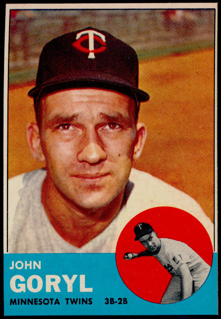
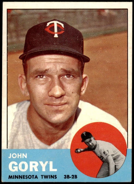
The cards from these special sets have been described as being cut with a beveled edge and some are known to be "slightly" undersized. Well take a look at this John Goryl presentation card, pulled directly from one of the boxes:


Compare that to borders on this regular issue card:


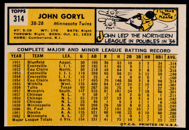
Both of those are factory cuts!  I'll get deeper into the production process in a minute but that gives a new meaning to "short cut" doesn't it?  Here's the presentation back for Goryl:


And the regular issue:


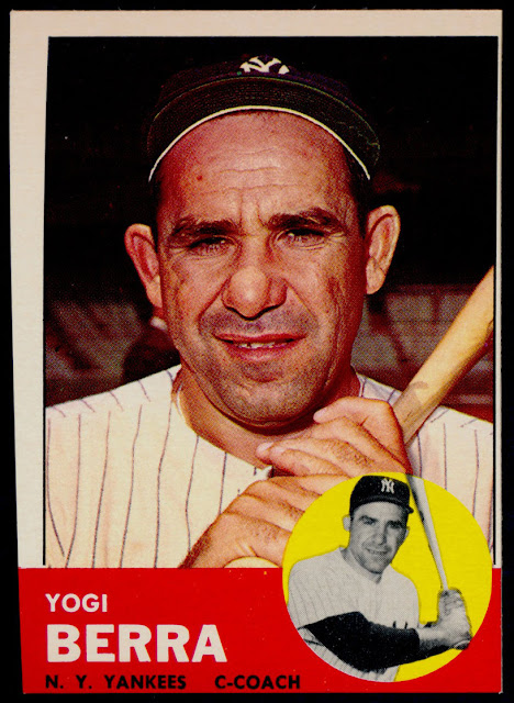
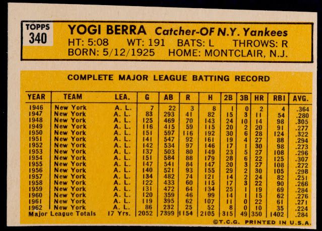
Yikes!  But wait, it gets worse.  Here's the Yogi Berra card from Don's presentation set:


Yeah, that's totally off but until you turn it over, you may not realize by just how much:


Kind of ruins the whole extra gloss and bright colors bonus that comes with these! Now it's not all like that, many cards in these presentation sets measure up and look great-the boxes can yield PSA 8's and 9's.

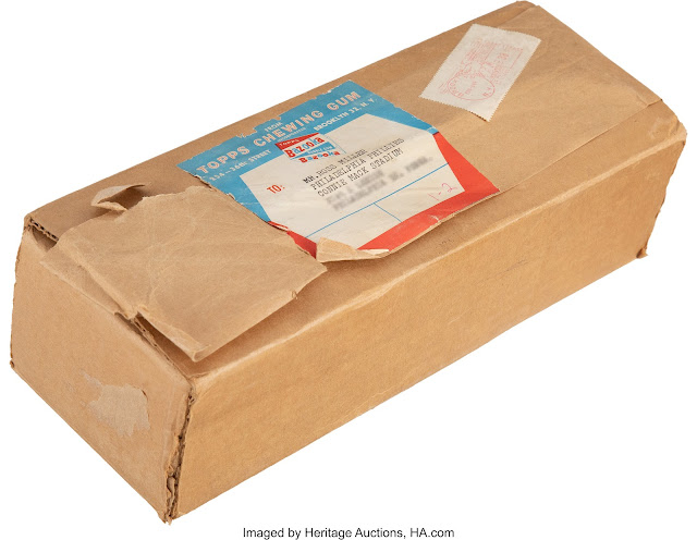
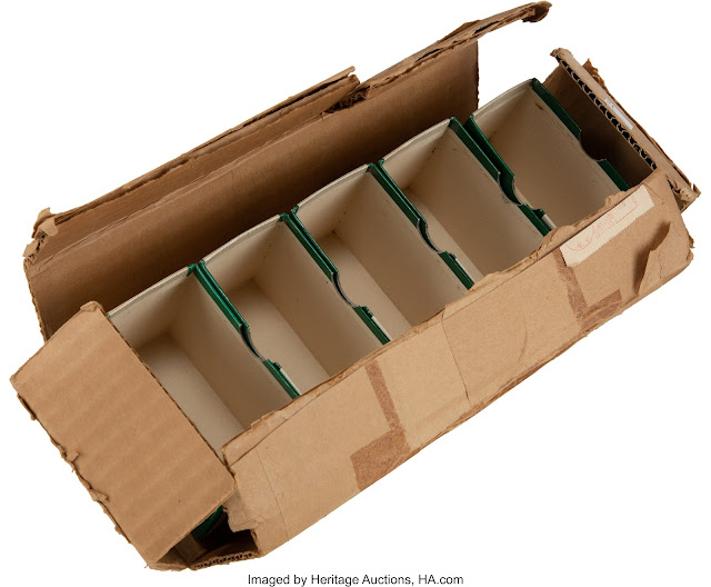
Heritage Auctions just listed some presentation set cards and also featured the mailing box from the 1963 set:


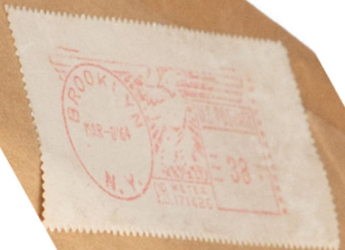
As it turns out, it wasn't mailed to that Phillies executive until March 8, 1964:


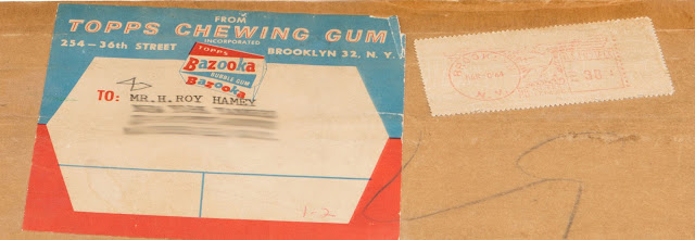
Seeing this, I went back to the mailer I covered in my post from five years ago that sent a 1963 presentation set to a Yankees executive:


Same date!  This all begs a few questions:

  • Did Topps save up sheets from each series then cut them up well into the next year's production cycle?
  • Did Topps have new sheets printed up to take care of the presentation sets?
  • Did some executives write in after the fact to request a set?
  • Who cut these things? 

Better gloss seems like it's just a matter of applying a shinier varnish, while the more vivid colors can be attributed to a fresh stock of inks or a slightly more intense mix on them. But the cuts can be wild!

Before I sign off, check out the inside peek at the 1961 mailer:


The date can't be found on this, nor the recipient unfortunately but it illustrates how the cards were packaged (with exposed edges in the smaller boxes), and how tight a fit the outside mailer offered.

So once again, some questions on a Topps obscurity have been answered, which in turn have created new ones.  Just another day at the office at the main Topps Archives Research Complex and Vault!


Saturday, August 12, 2023

Iron Horseplay, or, Give A Hoot

Two killer (and fun) Topps pieces in two different auctions will be hammered later this week, each differing vastly from the other in subject matter but very much similar in scarcity. The checklists, incomplete for the moment (and possibly forever on one) for both are of interest to me as well.

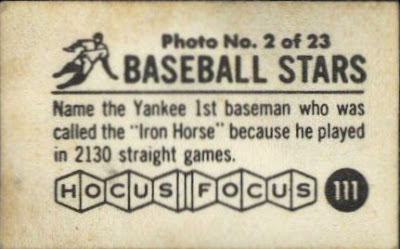
As many readers here know, I have been trying to track down the final subjects in the 126 count "Small" version of 1955 Hocus Focus for years now, to complete what is now a 68-year-old checklist,. My last post on these had it down to 2.5 subjects (subset numbering was unknown for three subjects when I wrote it, with one of the fronts known).  Well all has been sorted out except for one final subject, thanks to this little bauble surfacing and now on offer the Love of The Game Auctions:


It's actually in a PSA slab now but I like the look of  the card outside of its holder.  Here is the reverse, it's #111:

Unreal!  When I started looking at this set in earnest while preparing my 2013 book on the early years of Topps, I was 17 subjects shy of completing the full list of subjects from nos. 97-126 (these 30 cards are the extension of the "Large" set, which concludes at #96). Now all that's needed is to find #97, which is possibly U.S. Grant (as Robert E, Lee is card #98).  Surely someone out there has knowledge or a scan!

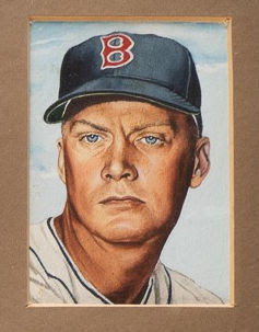
The other fun piece is a 1953 painting that went unused in the Topps set that year, which has appeared in a framed piece on offer at Robert Edward Auctions:


These paintings come down through the family of Topps founder Phil Shorin and push the count of original art near 200 now (out of a possible 280+).  He must have been taken with the cleaner looking pieces, as only a couple have any trace of the rubber cement used in the production process on them. 

Now, take a look at the upper right corner painting:


Yup, it's Hoot Evers, a subject which, thanks to an old piece of correspondence from Keith Olbermann, was thought to exist as an unissued subject but had not been seen until now. I wonder if any more unissued subjects will ever turn up.  I suspect the odds are stacked against it but anything is possible in the Topps universe!

Saturday, August 5, 2023

All Mod Stick-Ons

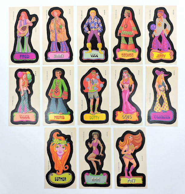
I managed to snag some grail-like pieces a couple of months ago, in the form of Topps Mod Generation Stickers, believed to have been issued in 1969. While I've covered these previously (see here and then click down as far as you interest takes you) it's been using production items like transparencies and proofs, as these are truly rare birds since the test of these seems to have failed miserably. That failure, coupled with the built-in self-destruction offered by any kind of stickers, has led to a supply issue that's stretched well over a half-century now.

So here are 13 of these bad boys (and girls), in all their hippie-fied, psychedelic glory:


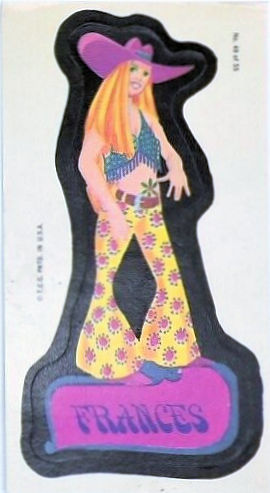
The detail on some of these is impressive. Check out the bead and fringe work on the halter top and the pattern on the bellbottoms Frances is wearing (and is that a marijuana leaf tattoo around her belly button?):


As you can see, most of these are full figures, with just a single portrait in the batch I snagged.  As expected, the backs are blank:


Something intrigues me about these beyond the look of the stickers though.  Topps generally (although not always) included some kind of card in their sticker packs to stiffen the novelty, even in a test pack, but I've never seen any reference to one for this issue. I'm not sure why that is.  Perhaps the answer lies in a couple of other obscure sets, neither of which has yet to yield me a type example.  Those would be Pop Guns (commodity code indicates 1971) and Goofy Goggles (said to be 1967), both roughly issued around the same time as Mod Generation and just as scarce. Both of these were sold in an elongated envelope, like the almost-perennial Flying Things, but I do wonder if one of them was planned to ride along.  Probably not but the idea intrigues me.