Showing posts with label Topps Salesman's Samples. Show all posts

Saturday, April 27, 2024

One and Done

A quite interesting (and supremely rare) Topps salesman's sample recently came across my transom, courtesy of Friend o'the Archive Larry Sarver.  While most samples are related to Topps Baseball cards, and ran through 1967, with the occasional Football piece mixed in, non-sports samples are almost never seen.  In this case, Topps was hawking one of the best sets they ever produced: 1955's Rails & Sails!

True salesman's samples had only just premiered with the 1952 Baseball set, so this is an early one indeed and Topps was still tweaking the formula here:


Isn't that a thing of beauty?! The reverse is just as intriguing, with a pitch clearly aimed at the father's of the time:

Two cards numbers are obscured by the sticker (which I will get to in a second), they are, from the top #37 and #73. However, the blurb drawing attention to the first four color backs for a Topps set really caught my eye.  Topps was constantly trying to improve and sharpen the look of their cards at this time as they were attempting to outpace Bowman with everything they issued. Bowman never really managed to make their card backs all that exciting, whereas Topps began using all sorts of little illustrations and clever graphics on their reverses in earnest starting with Wings in 1952, although their use of color was limited originally, gradually improving as 1955 rolled around.

Here's the thing though-shortly after this set came out, Topps ended up buying Bowman and pulled back to a limited use of color on the card backs!  I'm trying to ID the next set with four color backs put out by Topps and am really coming up blank.

Saturday, April 1, 2023

Color Me Impressed

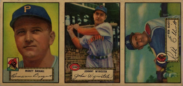
A really cool 1952 Topps piece popped up recently - an intact salesman sample and a colorful one at that.  Check it out, this thing is a marvel:


That is just a fabulous array of color, surely the results of a combined effort by Ben Solomon and Woody Gelman's art service.

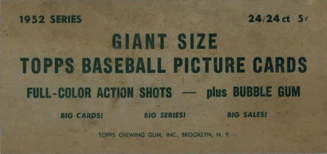
The details are scant but succinct (and turned out to be correct):


While I'm sure there's more than just these out in the wild, I've found the following intact combinations via the some old auction archives, SGC and PSA pop reports:

8 Marsh/9 Hogue/10 Rosen

12 Bagsall/13 Wryostek/14 Elliot (as seen above)

18 Combs/19Bucha/20 Loes

41/Wellman/42 Kretlow/43 Scarborough

42/ Kretlow/43 Scarborough/44 Dempsey

45 Joost/46 Goldberry/47 Jones

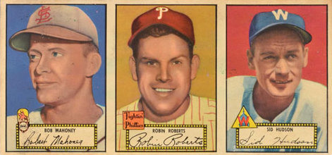
58 Mahoney/59 Roberts/60 Hudson

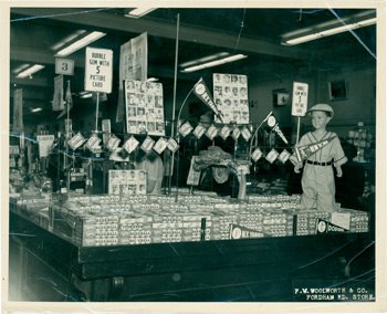
Notice for instance the one number gap between the samples headed by no. 8 Marsh and then no. 12 Bagsall.  If you look a couple of entries down from them, you will see samples headed by no. 41 and then no. 42, so Topps was kind of jigsawing these.  I suspect this was related to the larger panels they would cut up and use as shock absorbers for the shipped cartons, which ended up hung as a display sometimes.  Look here, if you do the math on what's left from 4 column wide partials hug at Woolworth's in the Bronx during the initial rollout of the set, that leaves behind two 3 column strips per row:


True quads in a 5 x 5 array are also known.  Here's one, you can see the where the images for the  Mahoney/Robert/Hudson salesman sample were located:


A cut up of this one seems to be out there too based upon the SGC data:

71 Upton/72 Olson/73 Werle

Here is the Mahoney/Roberts/Hudson panel:

That has the salesman's sample reverse but by the time of the second series Topps had moved on to a better format:  


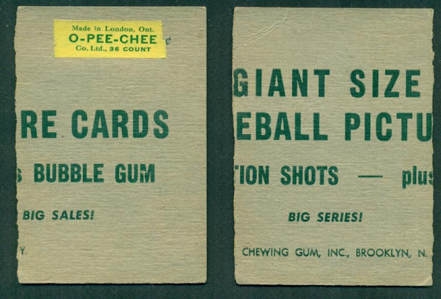
You will note the bottom border looks handcut.  It's impossible to know for sure but I'd say that was done by Topps and not the addressee, Mr. Joseph G. Spear. The right two cards (reverse view) look to be pasted over by the mailing label and I would think carry the card backs.:


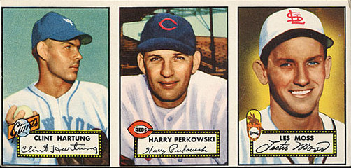
That's 141 Hartung/142 Perkowski/143 Moss.  There's a lot more to all this and I'm sure other combinations are known (and by all means send me scans if you have any). Since it's April Fools Day, I'll leave off with this.  It's not clear if it's legit or not but Topps did sell the 52's in Canada, although possibly only starting with the second series.

There's some other things going on with these 1952 Topps Baseball that I'll get into next time.

Saturday, October 23, 2021

Are You Ready For Some Football Salesmen Samples?

I realize that Baseball Salesmen Samples get most of the attention whe it comes to such things but Topps issued these little teasers for most, it not all, of their standard card sets through 1967 or so and the 1963 and '64 Football samples below are one such example:


Pretty sweet, right?  The proportions on these "three-strips" always seem just right to me, probably due to some extension of the "golden ratio" or some similar type of aesthetically pleasing combination of length and width:

The reverse is quite wonderful:

That "special feature" may have been fun to rub off as a kid but it certainly bedevils modern day collectors!

Sometimes samples got cut up, probably by a wholesaler's or retailer's kid:


Still nice but I really prefer my strips unsullied.

1964 brought this; I have to say I'm not a fan of this design as I want to cut along the stars, which resemble dotted lines to me:


1964 was an AFL only affair for Topps, a big leap of faitth in a way but I'm betting the contractual rights were cheap.  I like the back better than the front:


Too bad these ended prior to 1969-the first series Football cards from that season would have looked stupendous given their full bleed borders-this uncut sheet certainly gives you an idea though:

It still pains me that Topps added white borders to the second series and it seems like a real head-scratcher. Ah well.......

Saturday, September 29, 2018

Dearth Of A Salesman

Yonks ago, when I made two posts (here and here) about the old salesman's sample strips Topps used to print up and send to their wholesalers and the like, there were four strips I could not find scans of.  And yes, I know that I ended that last sentence with a preposition and, also, that a lot of the scans on those old posts are fuzzy as can be. I'll probably amend those fuzzballs someday but for now, will have to be content with filling in some of the missing examples.

The 1958 looks to have very much set the tone for 1959's model.  Check this bad boy out, courtesy of Friend o'the Archive Don Johnson:


That's a killer shot of Billy Hoeft by the way.  Now, look at this back, which is also red, red, red:


Now compare that to this 1959 sample reverse:


It appears that Topps could manipulate the reverses to allow an area for an address to be added, so these samples were used in a couple of different ways at least.

As previously noted, the last sample was produced in 1967:


I always liked that shot of Earl Battey in his windbreaker.  Reverse-wise, while the authenticity of the autographs is dubious, someone at Topps clearly loved the idea:


So that example was for a jobber (wholesaler).  In 1967 they probably had as many orders as they could handle. Now, take a look at that illustration of the Dodgers player.  It must have been drawn by the same hand that did the 1965 Topps Transfers:


I'll hopefully have the other missing samples (from 1953 & 1956) up shortly.  And if I can get a few more scans, I'll show the larger, "4x4" and "8x8" versions that they issued in a couple of years in a future post.


Saturday, November 18, 2017

A Slew Of Samples

I was inspired today by the recent news that well over 100 1966 Topps Baseball Salesman Sample strips are being offered up on eBay. Intact Salesman Samples, normally found in strips of three with a few variations on the theme, have always been difficult to find so for a hoard of this size to be liquidated the seller must need to be dumping them in a hurry. But I don't have those '66 strips in my sights today but rather thought a look at some strips and remnants outside of baseball would be interesting.

Here's a piece of the King recently offered on eBay:


Amusingly, and I realize it's hand cut, centering was an issue even on the samples! There's no way that left border measures out:


Here is what the complete 3 card sample strip looks like:


I realize 50,000,000 Elvis fans can't be wrong, but neither was $50,000:


After Elvis, the next fad was TV Westerns and Monsters. I can't find my scan of a 1959 You'll Die Laughing sample so it's the former and these two fit together like a puzzle.  The third card must have been excised more cleanly.


The back of this one has a bit of design; Topps was starting to move past basic text on these once the Bowman purchase was out of the way, or so it seems
.

I can't find an intact 3 card TV Westerns sample, so you have to imagine the last card! I always thought it odd the set had 71 cards but the above titles match the issued set.  Either a series they planned to include didn't work out as the count should probably be either 77 or 88 cards or they had trouble obtaining individual rights to a certain actor or two that screwed up the normal "divisible by 11" set count of the era. Maverick is a notable gap in their offering so maybe it was an inability to get a release from James Garner or even John Kelly that caused the truncation.

I'll close with a really sweet batch of 1963 Football. These are three but perhaps that count is low? Take a look:


The backs look like so:


Either that's a "four" or an alternate back exists.  Sometimes wholesaler's (jobbers) samples left space for an address.  Love the use of the green on the reverse but it should extend to the right a bit more on the third card, along with the text.

Saturday, July 10, 2010

Sunset Strips

Back at it today kiddies, as we finish our look at Topps Salesman's Samples (for now) before your webmaster takes off for some R and R.

For the first time in four years Topps went with horizontal cards for their 1960 baseball set and also mixed it up with the sample for the last pre-expansion year:


No corresponding back scan yet but as advised previously, I'll do a catch up thread with all the missing samples at some point.

1961 brought a return to the familiar:


Not only do the 61's look great, they celebrate the year of you blogmaster's birth!

Whitey Ford and Ken Boyer make an appearance as the representatives of the Stamp inserts on the reverse and presaging his assault on the record book, we get a Maris back perhaps in homage to his 1960 AL MVP award. I am not sure if other players are shown on different stamps on other samples nor if the small Magic Rub Off set was shown later on down the line and further investigation is in order:


1962 shows clear signs of the expansion era with a capless Gil Hodges (went to the Mets from the Dodgers) and a logoless Minnie Minoso (joined the Cardinals for a brief stint after playing for the Pale Hose the year before):


More stamps, albeit trimmed, on the back, plus the incredible Mr. Maris again. Jim O'Toole and Jim Gentile seem like odd choices for representing the stamp insert in '62 but both had big years in 1961, especially Gentile:


1963 brings some stability to MLB and presumably Topps. I love strips where full bleed borders just keep going and going and going...


Stan the man adorns the reverse but oddly there is no mention of the Peel Off inserts in 1963:


The immortal Stan Williams gets card back honors for some reason.

Sorry for the '64 scans, my graphics-editing skills are minimal:


The reverse is weird as we get some generic coins up top just when Topps should be moving toward realism. Still, you get a Mantle back and a mention of the coin inserts:


1965 shows Topps last Brooklyn set:


The reverse gets a little colorful and shows an Embossed insert. I can't make out who it is but then again, you can;t make out who's who on the insert either!


1966 would be the start of the Duryea era. Koufax and Mossi are really the yin and yang of 60's pitchers, aren't they?


Things are getting real interesting on the reverse in '66. With a color shoot of a Koufax decal insert:


The '66 pack graphic is also given prominence in the first year where penny packs were not available. Check it out:


Topps ended the traditional salesman's sample strips in 1967 but I don't have scans yet, sorry!

Once again thanks to Anthony Nex for the scans; any technical difficulties are of my own doing not his. Off to Florida for some sun and surf - see you all in a couple of weeks!

Wednesday, July 7, 2010

Strip Showstopper

Last time out (yesterday, actually) we explored the world of Bowman's salesman's sample strips and promised a peek at Topps own strip show. Well we're off!

Topps had salesman's sample strips produced for the 1952 baseball cards and so predated Bowman by at least two years. I am not aware of any earlier strips but it is possible they could have produced some, especially for 1951; maybe one will show up someday. The 52 strips look exactly as you would expect:


Those are numbered: #41, 42 and 43 which fits the known pattern of how Topps consecutively printed the 52's, row by row. The back touts the Giant Size theme that was starting "Taps" for Bowman.


Boy a box of those would be sweet!

The '53 strip adorning the header of this blog is not a sample, merely a remnant. No scan as of yet (I will do a catch up thread when I get ahold of scans for all the missing years).

There is a nice sea of white on this one from'54:


More of a mashup now as left to right we have #'s 24, 45 and 33.

The back is getting to look like the "classic" samples, which have one facsimile back and some advertising but this one is transitional. Check out the truncated reverse of the middle card and note the flip flop, which is odd given that doubled rows of similar colors were how the 54's were arrayed.


By the way, the backs on the samples often did not match the card fronts. Sometimes a random back was used repeatedly.

1955 brings us a vertical strip:


Nice but the real eye-opener is on the back:


Yes, that is a 1955 Doubleheader card affixed! Here, we have a better orientation and an opened DH:


You can see the ad mentions the Double Headers in this blow up:


I guess calling the DH's a gimmick seemed like a good idea at the time! It seems like there is no hope of ever finding a 5 cent Doubleheaders pack; they appear to be solely a penny item to be sold alongside the regular issue.

No '56 scan today kids, so we move on to 1957:


The strip is horizontal but the back is vertical:


That is the "classic" look I referred to earlier. I can't quite make out the middle part as the scan is blurry but the middle would be used to good effect shortly.

No 58's either today I am afraid but we can close out the decade with a '59 strip:


Aside from having the fabulously monikered Gene Green on a pink card (?!), the back adds a new wrinkle:


That is the address of a grocery wholesale in Chicago added to the mix in the middle. I suspect Topps started personalizing samples for their wholesalers to hand out as order reminders while having their own samples going to the wholesaler (or jobber if my understanding of the nomenclature is correct). I think the 1959 sample is really sharp and like how the card back is so green. The premium offer reference is just icing on the cake.

Look for a look at the 1960's samples next time. Thanks to Anthony Nex (again) and Don Johnson (1959 collector supreme) for all the great scans!