Saturday, July 29, 2023

A Real Rust-Up

As longtime readers of this blog know, I've been trying to document the various comics Topps included with Bazooka before Bazooka Joe became their ne plus ultra.  From roughly 1947 to 1949 Topps issued a seemingly long series of sepia five-cent comics featuring mostly funny animals and humorous characters from DC Comics. They mixed in some other, non-DC stuff during this period so things look pretty random sometimes.  The length and cast of characters for the DC series (or any pre-Joe comic for that matter) is indeterminate but seemingly extensive as they pop up more frequently (a relative term, these are hard to find) than most others of the period and new subjects often appear when this happens. 

Case in point, numbered and unnumbered DC series exist and all are from the foil-wrapper nickel rolls, which both pre-and-post date the DC's. The five cent foils ended with the second release of the Bazooka Joe's in 1954, which were duo-tone essentially, and followed on the heels of a sepia-toned Joe. Penny foils ended a little earlier, probably in late 1953 but I have not seen any sepia DC's in one-cent form (given the nature of the strips, this is not surprising) and Topps seems to have let a divergence occur between the one and five cents comics at some point during the DC run as some other issues could be found in penny and nickel pack versions. As for the five-centers, let's take a look at some of the DC's.

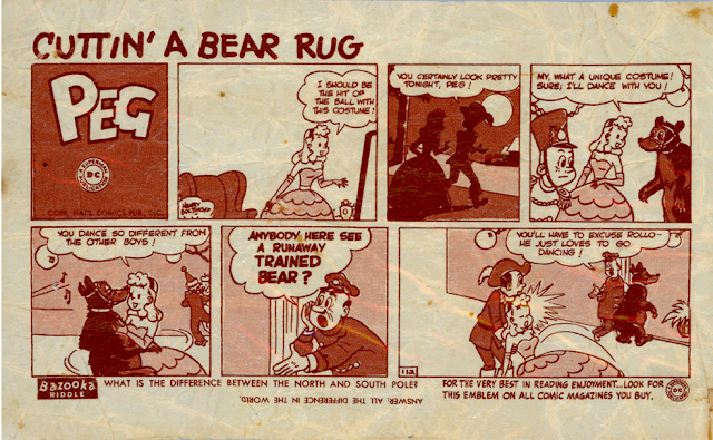
"Peg" no. 112. The series likely starts at #101 but that is very much unconfirmed and is also useless in determining if an even one hundred comics came before.


#115 finds "Lad and Dad" pushing a familiar Topps product in a way:


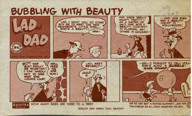
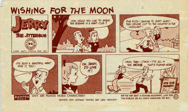
Dig that inked in July 1949 date!  "Jerry the Jitterbug" at #123 resembles, at least to me, a very milquetoast version of Harold Teen:


"Bonny" continues the fun and shows at least one subject appeared twice:


Note, however, the different style of the text at bottom as Topps used a tagline about saving Bazooka wrappers. Also, neither is numbered:


"The Dodo and the Frog" was a long running feature in some DC comic books and is my favorite of all the DC Bazooka's. It may be numbered in the lower right corner of the lower-right panel, can't quite tell:


"Chip" (two, even), "Gerry", "Rusty Rhino" and "Bronco Buster" s are all known subjects and BFF o' the Archive Jeff Shepherd; recently unearthed this beauty:


The lowest number I've seen is 107 and none have been found extending past the 120's; where and how long both the numbered and unnumbered versions come into play are open questions. I'm sure other characters exist beyond the ones above.  

These pre-Bazooka Joe sepia comics are very hard to suss out, especially the five-centers, until 1953 rolls around.

Saturday, July 22, 2023

Wanted Dread or Alive

Topps was really cranking out sets after their 1966 move to Duryea, PA seemingly freed up their New Product Development folks, with a number of odd and oversized issues, often posters, starting to appear with regularity. Unless they were issued with a sports theme, the posters, much like the card sets of the time, took on a smart-alecky tone in most cases.  A perfect example of this is the 24 subject set from 1967 called Wanted Posters, which measure 10" x 18 1/2" in size.

There are hard to take images of so forgive the wrinkles below.  This is a very typical example and shows how the poster was folded to fit the pack:


Topps wanted the young consumer to immediately (and specifically) deface these, which I assume led to a number of poundings of the younger sibling if the poster was then hung somewhere in the house:


I don't think hanging this one would cause a bully to cease and desist:


I'm pretty sure you could not issue this poster today:


When's the last time you saw a kid with a slingshot?!


I think this one would cause more trouble than it's worth:


Unfortunately, many of these are still with us:


The complete checklist is like so:

Baby Sitter
Barber
Big Brother
Butcher
Candy Store Owner
Cheapskate
Class Bully
Dentist
Doctor
Father
Garbage Man
Kid Brother
Kid Sister
Liar
Librarian
Monster
Mother
Next Door Neighbor
Principal
School Flirt
Slob
Teacher
Teacher's Pet
T.V. Repairman

The set was reissued twice in later years (1975 and 1980), which I'll get into at some future point as it's unclear if Topps made changes on the later sets. I can tell you the 1975 posters measured 9 7/16" x 18" while 1980's were a whopping 12" x 20'!  1980 is also numbered on the poster, unlike the 1967 and 1975 releases. 1967 used a pulpier, browner stock than the two later releases, although it's a better quality paper than say the 1967 Baseball Posters. 1975 saw an improved, whiter stock and 1980's is even whiter and better still.

A related set of stickers was also tested then released nationally, seemingly in between the 1975 and 1980 sets. Topps got a lot of mileage out of the artwork!

Saturday, July 15, 2023

Tisn't The Season

No, tisn't the season (at all) but I did just procure this fantabulous American Gas Stations Season's Greetings double wide match cover!

AGS was the company owned by the Shorin family before they started Topps-you can click over to the labels to find out more. I reoriented the main graphic for everybody's viewing pleasure:


It's got a kind-of art deco feel, which makes sense as it would have been issued in the 1930's; it's really well done, isn't it? The Shorin's were observant Jews but their choice of holiday greetings was always centered around Christmas, even if not overtly stated.

The inside is pretty sweet as well and shows off the rushing Uncle Sam AGS mascot to great effect:


It may read a little corny, especially within the "security and happiness" wreath but the Depression was still wearing on and nothing could really be taken for granted. Given the hellacious temperatures and humidity outside as I type this, a little Christmas in July feels kind of nice!

Saturday, July 8, 2023

Going Batty

Following a truncated 60 subject set of Baseball Buttons that were released in 1956 Topps started issuing a fairly steady stream of pin, or more precisely, button issues in the 1960's.  These were eventually sourced from Japan and imported into the United States.  After a half-decade hiatus they came back with what may be their best non-sport button issue ever, 1974's Batty Buttons.  Some sources say 1973 and there are no commodity codes to guide us, so either year  is possible. Twenty-four subjects made up the checklist, which was a decidedly wide-ranging one. 

I found a nice scan of the pack over at the Busy Beaver Button Museum when I realized I did not have one:


Typical Topps smart-alecky stuff from the look of things, right?  Well some buttons certainly were in that mode:


OK, so right away it's obvious there are two distinct styles in these half-dozen: a Topps-standard illustrated look and a photo-based one. "Get Off My Back" was also a subject in the 1965-ish Topps Wise Guys Buttons but that set's version was an illustration. I'm almost reminded of Harvey Kurtzman's Help!  Magazine's fumetti's with the three bottom buttons.  Kurtzman and Topps Creative Director Woody Gelman were friendly and many artists did work for both Warren Publishing, who put out Help! and Topps (and MAD, and Cracked and Sick, and on and on....).  Kurtzman was the one of the first to publish Robert Crumb's work in any kind of widely distributed format and lo and behold, there is a Crumb-like knockoff in the set:


The "Kiss Me" pin above is in the photo-realistic category but that middle one is the most intriguing of the trio. I make the first 8 buttons in the set to be photo-based and I'm guessing Topps salvaged designs from three different planned button issues and decided to just do a mash up and see what happened in the marketplace. The timing works,  as Topps had been consolidating and streamlining operations in the wake of the March 1972 IPO so I could see some planned releases being scrapped or rejiggered.

The next batch of 8, which includes KOT,  are 100% illustrated and mostly feature words and an image. The last run of 8 however, well they all feature Universal Monsters!

Frankenstein's Monster, The Phantom of the Opera and Wolfman-nice! The full roster of monsters is like so:

17-Creature From The Black Lagoon (Get Lost)
18-Wolfman (I'm Available)
19-The Mummy (Remember Mummy's Day)
20-Werewolf (You Make Me Drool)
21-Wolfman (Warning-Full Moon Tonight)
22-Frankenstein's Monster (Ain't I Cute?)
23-Monitor of Metaluna (I'm A Brain )
24-The Phantom of the Opera (I Want You).

The Monitor of Metaluna may confuse even some classic horror fans but it's taken from the 1955 movie "This Island Earth", which was a color release from Universal. As you can imagine, this subset of buttons is quite popular and can get a little pricey; not crazy, but for a 1970's ancillary Topps set they can bring strong prices.

Saturday, July 1, 2023

Peeling Out

I can't believe I haven't covered these previously but the 1963 Baseball Peel-Offs are, in my opinion, one of the better inserts ever created by Topps.  These small (1 1/4" x 2 3/4"), colorful stickers were included in select wax and cello packs, probably commencing with the second series (Topps didn't always include inserts in series one).  As this pack rip shows, they were definitely found in 4th Series packs. At a mere 46 subjects, it was the sole pack insert in a  year where Topps was taking on Fleer for a share of the big league trading card market. 46 is a strange number for a Topps run of justabout anything, and I suspect there's a reason the set count landed there, which I'll get into momentarily.

First though, behold the colorful Peel-Offs:


That bright line running horizontally across the face of each player is an unfortunate production artifact, wherein the adhesive didn't see application at the cut line that splits the paper on the reverse.  Speaking of reverses, three types can be found: instruction back facing left, instruction back facing right and blank. The instruction backs are mirror images (and measure the same, ignore the aspects of the two below, they are identical in size):


Blank, well, is blank:


You often see gum or glue residue on them, no surprise given the layout of the pack in the video I linked in the first paragraph above:


So why only 46 subjects? Well, it's a strange number as the divisor is 23-are there any other inserts or short Topps sets other than those divisible by 11, where the divisor is a prime number?  On this note, Friend o'the Archive Al Richter has advised his research indicates Fleer experienced poor sales for their 1963 Baseball series, while I have also read that legal action shut the Philadelphia based firm's set down. Either way, I think what happened was related to Fleer's exploits and Topps pulled the plug on the inserts. It occurred in 1956 with Baseball Buttons, which was reduced to 60 subjects from an announced 90, following the acquisition of Bowman, so it makes sense to me history repeated.  It's possible a few planned subjects were in contractual limbo as well, which may have been an issue in 1963 for Topps.

The Bazooka Baseball boxes that year were sold with an extra feature within, the 41 subject All Time Greats set. That particular set was designed on a 45 card press sheet array, with four subjects double-printed.  Did Topps pull four subjects once the Fleer suit was out of the marketplace or did they just run out of time procuring the rights of four more old-timers? It's just strange that two insert sets from the same year are somewhat anomalous in length at a time when Topps was making a big spend on legal fees. Fleer also went after them in a Federal Trade Commission suit, which was ongoing in 1963.

The set checklist is interesting as the ratio of common players to superstars appears a little lower than in most other short Topps insert and supplemental sets.  I think this is further proof the set was truncated.