Tuesday, September 27, 2011

Bleed For Me Baby

Time to take a look at some patterns in the 1953-54 World on Wheels set, a classic Giant Size Topps creation.  I picked up an almost full set last week and as luck would have it, it came in a binder with 8 page sheets.  These sheets actually revealed a pattern to me that may help crack the code of the set's odd printing.


The first thing I noticed was that groups of 8 cards all share the same color block, although some blocks take up the entire span of the card top.  The above sheets shows the first 8 cards in the set.  This pattern continues until we hit #80.  The full sequence of 8 card "color blocks" runs Blue, Yellow, Pink, Green, Red, Blue, Yellow, Pink, Green, Red.  Perfection!  Even the lone card with a full bleed color block, # 49, which depicts the Long Island Automotive Museum, has a hint of yellow on it's upper left border.  This makes sense, it was printed amidst a run of yellow:


After #80 we get matched pairs.  Here is a sheet running from #81-88:


Does this mean yhe first series ended at #80 and not #100 as most guides suggest?  Quite possible I think but it's not an iron clad case as Topps was using 100 card half sheets in the time frame this series was printed.

Pink makes its first appearance starting at #85 by the way.  I won't show every iteration but we then get a group of four blues, four more pairs, then four pinks, ending at #104.  Then there are groups of the familiar 8 in yellow and blue, bring us to #120.  Three groups of four follow (ending at #132, followed by 12 reds! Those are probably a group of 4 and and then an 8 but who knows?  Groups of four then alternate again until we land at #160, generally considered to be the end of the second series.  Remember, each group of 2, 4, 8 or 12 runs consecutively in an odd,even pattern when the colors are matched up.  Then we get to #161, which features ten 1954 models:


Missing, one-sorry (it's a 1954 Hudson). The colors now run out of sequence. There are five matched pairs in the series (yellow, pink, blue,, green and red) but they are not consecutive and exhibit randomness.  This group of ten is far more difficult than the prior 160 cards and the pricing is higher by a factor of about 15 to 20!  So they were either deliberately short printed or tacked on at the end of a run.  Either way, they are tough. Plus they have a whole new style of caption, a sort of Deco looking font.  

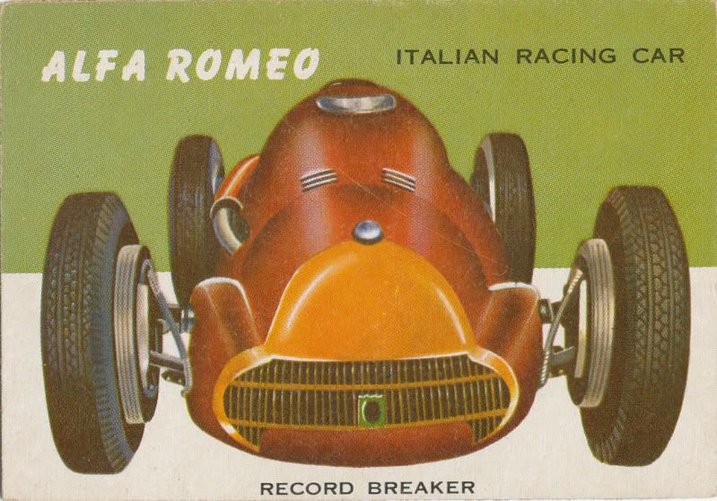
The fonts in the set are organized in a logical way and there are three of them used  in the entire set.  Here is the Old Time font used for any vehicle from 1920 or earlier:


Newer models had a font that is now called, fittingly, Bazooka:


While this Nash font shows the Deco look:


Note the small font underneath identifying it as a 1953 make.  A couple of 53's don't have the year shown in front for some reason but all of them that do have the little 1953.  1954 brings a new look for the new models, prominently showing the 1954 model year in the main caption, at least for US and UK makes:


Foreign makes, other than the lone example from the UK ( Bristol) all feature small, three wheeled cars but totaling only two in the run, get a Bazooka font for their 1954 style caption:


While all 1955 models, which appear in yet another run of ten difficult cards, get the Deco treatment as well:


The end of the set again arrays in five colors with unmatched pairs.  I am missing a few but nine of these are US models, with a total of five makes from 1955 plus another three-wheeler thrown into the mix:


The big story with the cards from #171 to 180 though is on the backs, although there is another oddity as well.  Here is #176, an austere looking Chrysler from '55 (not sure if that is red, or orange which would have been a new color):


The back looks fairly normal but red backs in the last series are ridiculously tough and priced at a ratio of something like 30-1, if not more.  That's because there are, for some bizarre reason, more "common" blue backs:


These are easier than the cards from #161-170, or so the conventional hobby wisdom goes.  Note the gap to the left and right of the blue bar at the top of the back. every card from #1-170 has full bleeds to the left and right edges; the cards from #171-180 do not and it suggests they were printed separately.  The blue color for the end of the run has not been explained anywhere I have looked.

The red back also lacks the full bleed:


There is one other thing....while that Chrysler red back above has a full bleed front color panel, it may be miscut.  I only have the one red back super-high so can't quite resolve it, since it's possible the reds bleed to the edge (can;t find enough examples to tell) but the blues all have a sliver of white off to the cut edge of the color block:


This too suggests a different print run as the first 170 cards all have full bleed to the side and top of the front color block.  As we have seen with the 1953 and 1954 baseball cards, Topps would match colors when printing cards in this fashion in a"pivot point" grouping of four. The white border certainly does not seem to suggest the final ten cards were printed like the previous 170.

So what does it all mean?  Well, we have the late December of 1953 contest expiry on an insert that came in the five cent packs and given the long lead time Topps had on their dated inserts, late spring of '53  is certainly a possibility for the first series.  The 1954 models are more vexing; did they come out with a second series in late 1953 or were they a true 1954 issue added on to a second run of the second series, or even a delayed run that only came out in '54?  And don't even get me going on the super high's!  Plus there is an old hobby publication referenced by Chris Benjamin in his 1930-60 Guide that stated Topps added 20 cards to the set in 1956!

I think I will ponder this a bit more, there are still the full width bleeds to think about.  Those may have something to do with speed.

Sunday, September 25, 2011

Pinpoint

This will be the first of two or three posts about the 1953-54 Topps World On Wheels set.  Issued hot on the heels of Wings and actually identified by the similar two syllable "Wheels" on the wrapper, WOW was a fabulously well illustrated set.


That;s one helluva an illustration, no? My concern tonight though, is not the cards, nor their stellar wrapper:


No, I am after bigger game, namely identifying the issue dates of this set.  Much like Wings, World On Wheels was a major hit and enjoyed high volume sales over almost a full year. Here, check out Wings, which were introduced a little after the 1952 baseball cards, was being sold into 1953 alongside the third series baseball pasteboards (indicating about May 1 on the calendar),  The item to the left of Wings is Clor-aid Gum, a Topps attempt at unseating American Chicle and their Clorets Gum, which would not end well for the boys from Brooklyn:


World On Wheels has some fascinating components,not the least of which are two, 10 card high number series that extended the set well into 1954 (oh, that's for another day).  The wrapper above shows a 1954 end date, which puts the cards being issued in two 80 card series in 1953 and a ten card "topper" once artwork on the 54's was available, probably late in the summer of 1953. The set has oodles of''53 models within the "regular" series, which ends at #160.  The highs though, give a peek at the 54's in the run from #161-170 and some 55's in an even higher run of ten up to #180. More on these phenomena shortly.

A lot of speculation as to the date of the set still takes place today, almost sixty years hence.  I can tell you that a contest insert issued in the pack has an expiration date of December 20, 1953.  Topps had long lead times on their pack inserts advertising contests and premiums back in the 50's, some stretching almost a year form the date of issue, although I would think the first series of WOW came out in the spring or early summer of 1953, once Wings had sold its last and had an expiry about six months in the future:


It would seem then, that WOW had a shelf life approaching 18 months-impressive!  I'll have more on this next time out.

Wednesday, September 21, 2011

Flipped Off

Back to 1949 today again kids-I want to take an introductory look at an obscure Topps product called Flip-o-vision. Clearly named after a newfangled machine called television, the Topps version was a flipbook of 30 thin "pages" that the purchaser had to bind together with a rubber band to flip through.  They were sold in an elongated five cent pack that held 10 three scene panels and some gum.


There was no corresponding penny pack as one would have held a mighty short movie.  Also, following what I presume to be slow sales of their five cent Magic Photo/Hocus Focus packs earlier in the year, Topps reverted to briefly selling different products in their penny and nickel packs when Flip-o-Vision was issued in the summer of '49; they would return to penny and nickel price points for the same product again in early 1950, probably after seeing that one and five cent versions of Bazooka did not dampen sales when marketed together. 

I lied before, it's actually, it's really 29 scenes and a cover panel that make up each "movie", as this excerpt from Woody Gelman's ideas book shows with Dick Tracy giving us a look at a panel as well, courtesy of Heritage Auctions:


Here is another shot from from Heritage:

That's Chico Marx and Marilyn Monroe by the way.  That shot really gives you a good idea of how choppy the movie would be!  Here's a back shot of one scene, just so you can see what it looks like:


And here is a better look at a front, showing the old font used with Topps Gum in the "Topps Production" line:  


It says # 20 and a checklist of 49 subjects (all actors and actresses, not movie titles) was advertised on a wax paper insert that presumably was in each pack, making it the first Topps Checklist ever issued. Some on the original list are thought to have never been issued or pulled very early in the run.  The common wisdom is that they were pulled due to copyright issues or complaints by the actors depicted but no one really seems to know.  The current checklist is thought to number 51 according to Chris Watson in the Non-Sports Bible but Chris Benjamin has written in his Sport Americana Price Guide to the Non-Sports Cards that #60 is known, and that number is not shown as a known movie in the NSB so there could be at least 52 subjects out there.  It's possible of course that there are 60 of these little buggers out there but they are not widely collected and like so many of the pre-Hopalong Cassidy Topps sets, not a whole lot is known or written about them.

Topps had high hopes for the set, which was tied in to a promotion with some New York City movies houses but the it must have sold poorly as it was being liquidated as overstock by the spring of 1950.  However, there is some tantalizing, albeit tenuous evidence that these little flip books led to the 1951 and 1952 baseball sets.  That is a story for another day though and one that will have to keep for a while.  In the meantime, go here for an interesting read on all types of flipbooks.

Saturday, September 17, 2011

Counter Point Of Sale

For some reason I have had the scan below for a long time but never got around to posting it here.  I have written extensively about Topps Gum, the Shorin's main bread-and-butter product before Bazooka became what it became.  Much of the success that came to Topps because of these humble penny tabs came because of their marketing savvy.  The counter top display for the "Changemakers" is one such example:


The spot display tub held 100 tabs of Topps Gum (originally only one flavor came per tub but that changed) and the retailer got a handy redemption certificate he or she could accumulate and put toward some nice housewares or clothing.  The tub above is made out of cardboard and is not all that sturdy.  An earlier version, which I do not have a scan of, had a foil outer layer and was probably changed over to cardboard during World War 2 as the military needed as much metal as possible for the war effort.

Topps sold the tubs to their jobbers or wholesalers, if you break the figures down, at around 38 to 40 cents per tub, if a full carton was bought.  The jobber probably retained about 35 cents per tub so the retailer made a whopping two bits for each full tub they sold.  Still, it was a phenomenally successful product and it helped hundreds of Mom and Pop stores keeps the lights on.

Tuesday, September 13, 2011

Dice Is Nice

Every year or so it seems I run across an issue that is not exactly vintage but strikes a chord that seems Archives-worthy.  For over a decade now, Topps has issued Heritage sets that mimic the design of a classic and vintage Topps set but include current players.  The anniversary matchups are a year off (the first set was released in 2001 and used the 1952 Topps baseball design) but they are basically spanning a fifty year gap (much like your webmaster this year).

In 2010 a 1961 design was used for Heritage baseball; basic but fairly attractive and uncluttered except for the annoying logo at upper left (I despise them on TV as well):


It's the back that got my attention as it is a replica of the 1961 Dice Game in-house test that is among the rarest of all Topps sets:


Compare that to an actual Dice Game Reverse:


Pretty close, except for all the indicia on the newer card.  The take away is that this absolutely confirms the 1961 Dice Game cards were a Topps creation as they originals have no identifying marks on them. Retro is clearly in these days, as this 2011 Topps Lineage 3-D card of David Wright shows.  I've already blogged extensively on the 1968 3-D set so figured I would throw this on here as a bonus.


That card is not cut straight!  The 3-D effect is very "deep" (the player in the background completely disappears when you tilt the card one way and moves around a bit when you tilt it the other way) but I like the effect on the 68's a little more, even though it's not as technically advanced.

Now, when do we get some retro Punchouts?

Saturday, September 10, 2011

Little Wonder

I finally managed to get ahold of a 1948 Topps Tatoo wrapper for the Archive ant it arrived today.  I was all set to deposit it in the super-secure storage device I maintain at the Main Topps Archives Research Complex but when I measured it just before doing so, I found small surprise.  First things first-and I mean that-this was indeed the first Topps novelty gum product, issued in June of 1948, or just when school was letting out and the tatoo market would be at its apex:


The fold line obscures it but that is a 1948 copyright and as we already knew, it was a Bubbles Inc., product. I blew it up a little so you can see:


The Tatoo is muted in color, as expected and the little rip, endemic to all the smaller Tatoo-type wrappers, shows at the right below but it would be at the top in a vertical position:


These came in the "Tourist Pouch" configuration, as detailed here. I still desperately need a Tourist Pouch so I can mine its secrets but have not had any luck even finding a color scan of one.  The front of the wrapper is indeed quite slick as I thought it would be but the surprise was that the wrapper measures a full 1/4" shorter than I presumed it would.  The width was the same 1 3/16" that it's younger brother had in 1949 but it's only 1 3/8" long. I don't know if a smaller gum tab was used in '48 or if they just used a shorter wrapper.  As always with Topps, I have learned to expect the unexpected.

Wednesday, September 7, 2011

Sly Sy

Sy Berger, who was pretty much the public face and voice of Topps for a good half century or so, is on record in numerous sources as stating the caramel in the packs of 1951 Baseball Candy reacted somehow with the coating on the cards (presumably red and blue backs) and caused children to be sickened.  Take this quote from a 2001 USA Today article for instance:

"The finish smelled like kerosene,"


Then have a look at Mint Condition, by Dave Jamieson, where Sy Berger states:

"You wouldn't dare put that taffy near your mouth....I won't mention the printer's name who printed the cards but we ended up suing him, and that '51 series was really a disaster."


Other than the fact that it was caramel and that the whole story is likely BS, ol' Sy is right on the money! 


Now I do not blame Mr. Berger, who likely was reading from some PR flack's sheet for most of his professional career, for any of this.  He was after all, a good company man.  But here's the rub: I have done almost a year's worth of extensive digging into the early history of Topps and have read through pretty much anything there is to read about the firm in 1951 on Google Books, The New York Times website, any number of old newspaper archives and numerous books and periodicals and cannot find one contemporary account of any child being sickened by the caramel packaged with the 1951 baseball cards.  Zero. Zip. Nada.


In fact, if you look at this scan from an old auction showing how the caramel was packaged in the five cent packs, you can see the candy was segregated from the cards:


Now I do not know if the candy was individually wrapped in the penny Baseball Candy packs and I certainly could have missed a key reference somewhere but with no evidence from 1951 showing up I am really having doubts about this story.  Plus but that team card is from the first printing of that set so the caramel wrap was in the earlier packs.

What I think actually happened is that Bowman slapped Topps with an injunction and forced them to stop selling Baseball Candy in 1951.  I think the team cards that say 1950 on the obverse were a desperate attempt by Topps to stop the injunction by displaying an incorrect date and it failed (It has been known since at least 1960 that the undated team cards were issued first and then reissued with the 1950 date).  Further, I think that the 1952 dated box for Doubles packs means Topps felt they could market the cards in that year as the players involved had contracts that were in effect or the subject of the injunction and that once the 1951 season ended the right of Bowman to enforce their contracts for that year ended.  I have not been able to find the legal citations supporting this yet but there is later litigation between the companies that hints at it.

I am also starting to wonder about Sy's story concerning leftover 1952 high numbers being dumped into the Atlantic Ocean in 1960 while he acted as a Supercargo but doubt any evidence to the contrary exists.  With the Baseball Candy issues, there is definitely a chance of proving it wrong but I do not have a subscription to Lexis.

Monday, September 5, 2011

For Two Cents Plain

It's not an election year in most parts of the country but I am in a presidential mood today.  A while back I took a look at the 1949 Golden Coin issue that ended up being reused in any number of ways by Topps until 1965.  Friend o'the Archive Lonnie Cummins recently sent a long some box scans of the 1949 version that seem to support the notion the cards did not sell well when first issued.

Check this box out.  Not only is it in really nice shape but it adds a new layer of mystery to the set:


Yes, Topps has added a coin to the pack i order to move more product.  They must have done this quickly as the main tag line on the box indicates "another coin in every bubble gum pack" but the splash lozenge clearly states 2 coins are now being sold.  If you look closely at the lozenge, it appears to be stapled in place:


I would surmise that the packs look the same as when originally issued.  The additional coin does not seem to have mattered much as the set was being liquidated as overstock by early 1950.  I'd wager there are more mysteries lurking when it comes to this set. Any other Archivists out there have anything good?