As seen in our last adventure, while things got a bit wobbly for Topps for the 1966 Valentine season, it looks like they got a lot looser the next year and even moreso following that.
At some point in 1967 Topps issued a set of 32
Nasty Notes, designed to look like the folded up sheets of paper kids passed as notes in class. The box is pretty generic looking:
The actual product though, is a Wally Wood
tour-de-force:
You can see how the Nasty Notes were designed to be folded to fit into a standard sized wax pack. And see that blank space above the series and printing information? That's important in distinguishing this set from it's Valentines related cousin, which we will get to in a moment. First though, the gag:
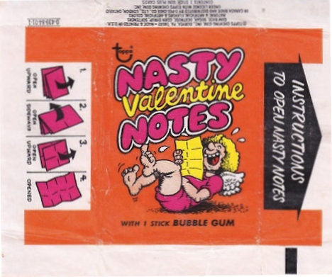
Measuring at 6 7/8" x 9 11/16" when unfurled, the 32 subjects in this set are mixed up in various checklists with a series called Valentine Nasty Notes. Those look like this:
See how the empty back panel now has a "To" addressing the intended recipient. These also measure out a quarter inch shorter than
Nasty Valentines at 6 7/8" x 9 7/16". You can see they are still a series of 32 however.
More Wally Wood awesomeness:
I have to say the larger, paper Topps issues of the late 60's are almost unparalleled in quality-and the best artwork seemingly went to the most ephemeral sets of the era. As noted (hah!) above, the two sets need their checklists disentangled. A task for another day....but what about year of issue? Well here is the box for the Valentine version of the notes:
That plastered on sticker makes me think the VD version is from 1968. I am assuming they didn't bother to change the wrapper:
This brings us to 1969, a year where I have no clue what Topps did for their Valentines issue. It's highly likely to me they reissued something because 1970 brought no less than three distinct issues, all with -0 Commodity Codes and also sold together in a "Subscription Series". I have to think the first in the series (more on that in a sec), since our carton below is clearly the second release, was from Hallowe'en (more on that in a sec too):
Valentine Foldees were essentially a reissue of the same set from 1963, with some minor alterations plus the "wheel design" of the past was replaced with one amusingly referred to in the hobby as "bananas". They came in this pack:
I always find it odd when a baseball or sports related premium offer ends up on a non-sports pack:
You can see Babe Ruth peeking out the back and here he is now:
That's actually one of two Ruth cards in the set. The Babe was still popular a generation after he had passed.
Nice Or Nasty Valentines were quite interactive for the day. As the card says:
This was not the first time Topps gave you a postcard to mail; they first did it with Goofy Postcards in 1957;
Here's two of the thirty three stickers in the set. Pithy, no?
That brings us to Valentine Postcards, easily the most mundane of the three 1970 sets:
The color scheme makes me think Topps had designed something for Hallowe'en before changing their minds!
The cards are a direct descendant of 1966's Insult Postcards, another set that may have been intended for Hallowe'en as well:
OK, now here's thing. Friend o'the Archive Lonnie Cummins recently sent me the following about the kick off of the Novelty Assortment Subscription Series:
Those are all 1970 sets as well. My guess is that, since Football was the current offering they packed 'em all together and dumped the first of the subscription series on unsuspecting wholesalers and retail accounts for Hallowe'en 1970. That would mean the "second series" Valentines offering was sent to subscribers for Valentines Day 1971.
The last phase of Valentines issues ends with a set partially drawn by Art Spiegelman (hey, that's "gelman" at the end!) called
Nasty Valentine Notes in 1971, easily the one of the most hippie looking set ever issued by Topps:
According to the
Dangerous Minds website, where I nicked that wrapper from, Spiegelman did the box and wrapper art, plus some of the notes proper, while the rest were drawn by Ralph Reece. most of the artwork is well-removed from Wood's finely drafted pieces (although it looks like he may have done one or two of these) but stellar in its own way:
The R. Crumb influence is hard to miss! Note there are only 30 subjects in 1971.
Like its predecessors, it's a two sided affair:
There's also something floating around out there purported to be "Nasty Valentine Posters" from the same year but are really just proofs of the larger panels, run off two at a time:
Topps must have segregated where the subscription series was sold vs the current (or even test) release in 1971. So anything in the series would have been issued for a retail release as well, making them something like a cross between a test set and a regional release, where the cards (posters, what have you), are reasonably hard to find but not impossible. A neat trick (once again) by Topps to dump their overstock!
Topps went public in 1972 and in preparing for the IPO shaved a lot of expenses. It looks like the Valentines Day issues were one of the casualties and sales would seemingly have been on the wane as well, making it an easy decision.