Saturday, October 28, 2023

Ten-acity

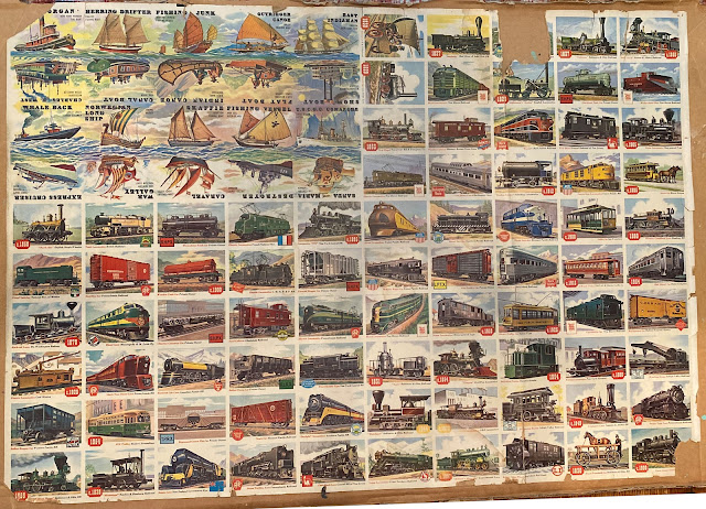
I got a ping the other day from a collector named Max Brustmeyer who sent along an uncut half sheet scan from the 1955 Topps Rails and Sails set. In addition to being a useful thing in and of itself, the sheet had a surprise in store:


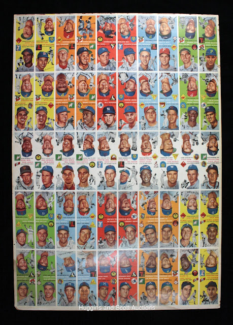
Yes, it's a 10x10 sheet, so there's 100 cards on this slit.  All well and good, but this is a 1955 set and Topps had, from what I know if it, moved to 110 card sheets the year prior, or perhaps I should say a minimum of 110 cards due to the nature of the flip-flops (a method used due to the full bleed tops of each card with Rails and Sails as well). Take a look at this 1954 Baseball sheet offered by Huggins & Scott some time ago now"


If you look at the very tippy-top of the sheet you can see a sliver of another row, which looks to replicate the second row.

So we have a 100 card sheet for Rails and Sails produced well after the (minimum) 110 card sheet containing 1954 Baseball was run.  The 1954 Baseball cards were produced by the Lord Baltimore Press, who were the main printers for the company at the time.  That brings up the question of who lithographed the Rails and Sails sheet.  Was it Lord Baltimore, or perhaps Topps had found their way to Zabel Brothers of Philadelphia in 1955?  

Another interesting thing is the "breakage" of the numbers included on the 1954 Baseball slit and the Rails and Sails slit.  The numbering on the Baseball sheet covers numbers 126 to 150 and then skips to 176 to 250.  The Rails and Sails sheet runs from 1 to 80 (Rails) then jumps to 131 to 150 Sails). The Baseball array is totally arbitrary in 1954 while Rails and Sails in '55 offers two areas of organization: the 4 x 5 block of Sails cards that is partially randomized with the top two rows containing nos. 141 to 150 and the bottom two with nos. 131 to 140, although they are scattered non-consecutively in each row. Below that we get six orderly rows of Rails, or I should say orderly columns as they all run consecutively through a five number top-to bottom sequence that reduces as it moves rightward when viewed from the front.  Namely:

26-30    19-24     13-18     7-12      1-6

Then the right half of the sheet goes back to fifty randomly arrayed cards covering nos. 31 to 80.  Crazy! The wedging of the Sails in the upper left corner is odd as well, it seems like it would be easier, given their full bleed backs and sides on the reverse (which explains why half are upside down) to just extend them out to full rows:

The Rails had no such need for inversion, being uniform in color on the backs:


I've mentioned before it seems like the Sails almost seem like an afterthought, or were originally meant to be a separate issue given how they differ in style so much from the Rails. Perhaps Topps was contracting some expenses in view of their pending offer for Bowman?


Saturday, October 21, 2023

My God, It's Full Of Stars

I was recently sent a wonderful package of in-house Topps goodies by Friend o'the Archive David Eskenazi, which originated with longtime Topps photographer Doug McWilliams, who spent 1971-1994 snapping pictures for the company. Doug has donated most of his negatives and prints to the Baseball Hall of Fame and also sent David some corporate ephemera over the years as they are longtime friends. Short story long, David was kind enough to send me a few goodies, and I am honored to add them to the collection of curiosities deposited in the Main Topps Archives Research Center Vault!

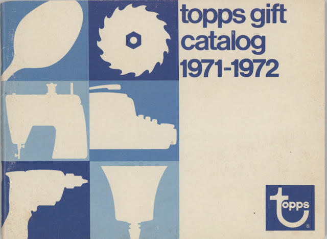
I'll have a few posts about this trove as the rest of the year progresses but wanted to start out with what might be the grooviest looking thing I've ever seen, namely the 1971-72 Gift Catalog from which ballplayers could, in lieu of a cash royalty from Topps, select from a bevy of goods.  And I mean bevy, as we shall see.

The cover gives a really good idea of where the graphics were going:


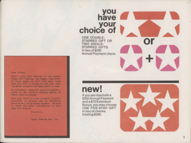
Right away, Topps shared details on how everything would go down:


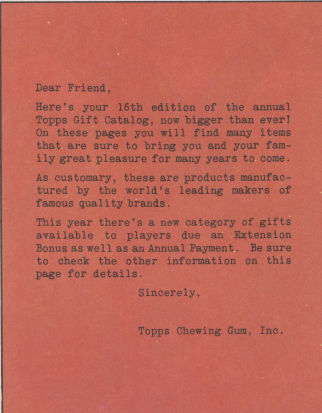
We've seen some of this this explanation before, in the 1973-74 catalog but that was a mere shell of what was about to be unleashed in the pages within this one. First though, dig the exposition from Topps as it turns out this was the first catalog to offer a Five Star gift option:


They would toy with the symbols in later years but the idea was always the same, if you had the extension bonus option, you could get better swag. The extensions, so far as I can tell were made effective by having a Topps card issued in the prior year, although I'm not sure if that covered the multi-player rookie cards. Topps kept track of all this on ledger cards they maintained for each player in their Premium Records Department.

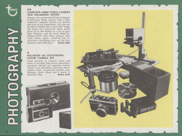
Now, let's get our groove on and look at each of the offered categories! Lots of players were into Photography, back when you had to know what you were doing:


All that do develop the film-can you imagine?! Although Polaroid had the right idea (for a time).

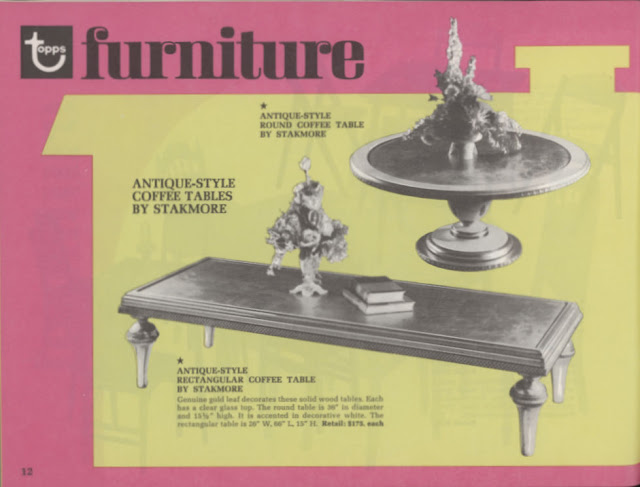
Some players would furnish their houses:


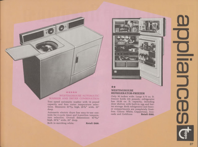
Furniture was a major category, with seventeen of the catalog's 64 pages devoted to it. If that didn't appeal to some folks, then they could opt for Housewares.  This page had a two star option. vs. just the one star seen for the two tables above.


Look at that Five Star Washer! Players could bank their points, that would have taken three years to nab! 

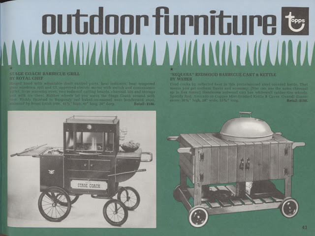
If you liked to spend your time at home outside, Topps had you covered: 


That Weber grill on the right would still be in fine shape if it was taken care of, the older ones were tanks.  Speaking of tanks, you could probably build one with some of these:


Meanwhile, Electronics were still expensive and big, quite literally in fact:


  And for the finely dressed man?  Well, there was this:


Look, I came of age in the 1970's and it was really the last best time in some ways but I would very much like to expunge from my memory all manner of Leisure Suits and wide ties-yeeeesh!!

There's more to it and the whole thing is just a riot of contemporary color and hip design.  This might also be the most extensive catalog they ever offered.  I only have a handful to compare to but it seems like it's got the most stuff and I suspect after their March 1972 IPO they refined things a little as the one after this was not as robust in its offerings.

In addition to banking points for more expensive items, players could also exceed their "star limits" and pay Topps the difference if they went over the $250 and/or $75 thresholds. Looks like the boys from Brooklyn knew how to work all the ends of this deal!

Saturday, October 14, 2023

Howdy Pardner

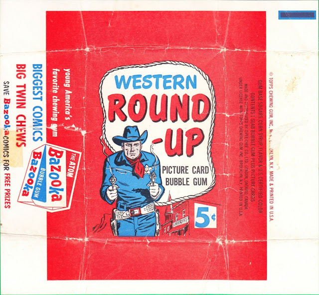
A long, long time ago, 1993 to be exact, I first read about the possibility of a paper version of the five cent wrapper Topps used for Round-Up, their 80 card Western themed set from 1956. Chris Benjamin, in the set description contained in his Sport Americana Price Guide to the Non-Sports Cards 1930-1960, mentioned it along with a note that the five cent retail wrapper featured "fragile layered cellophane" in red, with accented blues and whites."  It also mentions a five cent paper wrapper has been seen. I've had a crummy scan of the paper version for years but a newer scan has popped up and it's got far better resolution than the old one:


There's a scan of the back as well:


As it turns out, it's the same wrapper in both my scans, old and new.  I'm now leaning toward this being an internal production piece, or something like it, given the tape remnants and Benjamin's comments about a cello wrapper being used to market the set. I'm not sure how this paper version would have been used to retail the set by Topps as they needed sanitary packaging given the bubble gum that rode along.  It makes some sense to me that they created it in order to envision how to manufacture the cello version. It's also worth noting Benjamin's comment on the paper wrapper appears to refer to a singular piece.

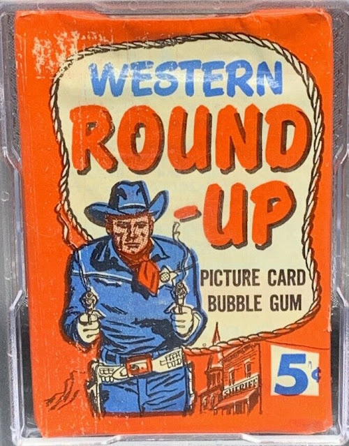
You cab kind of see the cello being stretched on this unopened nickel pack; those striations generally don't generally pop up on wax packs like that from what I've seen:


Ok, to confound things a little more, some of the five cent wrappers look like they could be wax:


Topps has "gone cello" with other sets over the years where a traditional wax wrapper was used otherwise, so maybe that's what is going on here.  No matter, it's intriguing and adds to the mystery a little.

Now, are there any other examples known of the paper wrapper out there?  I suspect there would have bene more than one of these if used internally.

Meanwhile, check out this May 1957 newspaper ad showing how Topps burned off overstock of the set:


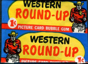
Looks like a penny pack was included with every 8-pack of wieners! Here's what the one-centers looked like-it's kind of weird that the overall motif of red wasn't carried over:

Round-Up may have been the last Giant Size set before Topps switched to the "standard" card size ushered in with Elvis Presley. I think either it or the 1956 Football set holds that distinction.

Saturday, October 7, 2023

Oh, Fudge!

Gary Gerani has spent over half a century entertaining people.  He's a well-known screenwriter in La La Land, an author and, to the point here, has created and/or contributed to hundreds of trading card and sticker sets.  This envious career arc essentially started at Topps way back in 1972 when he joined the New Product Department under the tutelage of Len Brown and Woody Gelman. He's now started to write a series of books that will take a decade-by-decade look at his trading card endeavors and his first volume tackles the Seventies in highly amusing fashion.

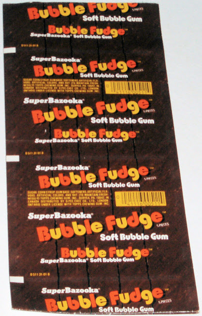
So I was in the middle of reading his enjoyably flippant book, which is titled The Card King Chronicles Vol. 1, when I happened upon a couple of paragraphs about a 1975 product called Bubble Fudge. It tickled a vague memory of seeing such a thing back in my reckless youth, although I'm pretty sure I never tried it, generally preferring my chocolate, then and now, in bar or better yet, ice cream form (chocolate chip to be exact). A little digging turned up a production piece for the outer wrapper and it is clearly part of the Super Bazooka line of softer gums Topps was somewhat urgently manufacturing at the time: 


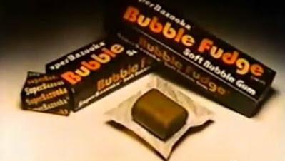
That line was started by Topps to counter the very real threat of Bubble Yum, which had been introduced by Life Savers earlier that year and was laying waste to Bazooka's market share. Super Bazooka launched with a product called Smooooth N' Juicy and Topps kept coming up with new twists for the line, one of which was Bubble Fudge.  Five pieces look to have come overwrapped in that pack, as I found this out there in the wilds of  Pinterest:


That's clearly a promo shot but I can't say it made the product look appetizing. As it turns out, that image was either used in or created for a 1979 commercial for the product, starring Johnny Bench. Despite the misgivings of Mr. Gerani, it seems like the flavor was around for a few years and it may still exist overseas.

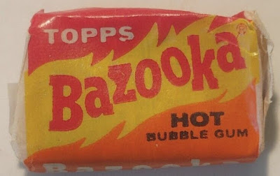
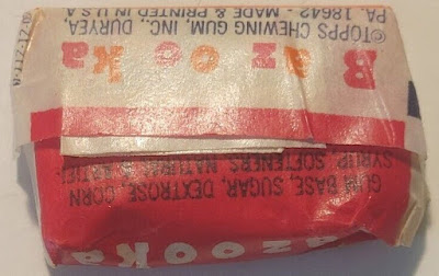
At the same time I was looking up Bubble Fudge, I found an eBay auction with a piece of Hot Bazooka, which, as it turns out, is a rare item.  Alas, I was too late but did get a couple of images:


I could not discern the last digit of the commodity code but a little goggling revealed this was a 1973 product. Jason Liebig, no surprise, over at his wonderful Collecting Candy blog has all the fiery details on this product. Now, I need to go find me a Hot Bazooka wrapper....