It's almost impossible to imagine it these days but prior to
1966 broadcast TV (essentially the
only kind of TV back then) was not definitively shown in color. Some non-prime time shows were broadcast in color by CBS as early as 1950 but there were few sets that could decode the signal. NBC made the first national color broadcast in 1954 but black and white TV was the norm until the early 1960's. Then, in 1965 NBC announced their new, fall prime time shows would all be shown in color; by the next fall all three major networks were doing so.
So right on the cusp of the color TV revolution, Topps started production of a series of card sets covering various TV shows (and a couple of old movies) that followed loose, unifying and slowly evolving themes, but oddly using anachronistic black and white photos. Roughly fifteen sets were issued in a five year period that to this day are not fully documented, especially as to their years of issue. Much of the confusion is due to the fact many of these sets were test, or even proof issues and suffered from minimal distribution or worse.
Discounting a few anthology type sets that came close and a bunch of penny tattoo issues, the first dedicated set from Topps devoted to a single TV show was issued in 1963 and saluted the Beverly Hillbillies. It was also issued in color:

Strangely, the fist color episode broadcast of the show was in the fall of 1965, at the start of season four. The DVD releases confirm the first three series were indeed B&W so the color cards are an oddity, especially since it is alleged they feature stills from the show. I wonder if they were instead publicity shots, done in color as they do not look like
flexichromes. A real mystery, eh?
The back is actually of more interest (sorry Donna!), for reasons we will encounter later:

1964 also saw a Topps TV release, the colorful Outer Limits set. Again, we have color (and how!):

The back is unique:

It's really the lettering of the caption on the obverse and reverse that I want to focus upon, which was very readable and looks to have refined the Beverly Hillbillies reverse font. I think it led to the adaption of what I call "default Topps block print". Look at this card:

That is a rare Daniel Boone example, which may have been produced for a
contest offered by NBC. The font, seemingly a natural progression from the crazy Hillbillies to the terrifying Outer Limits to the stoic Daniel Boone is quite orderly and would become a Topps staple very quickly; the fact it was issued in black and white is the other springboard for today's post.
Here is the reverse:

The caption font is just a hair different than what was on the front. Some backs were blank by the way:

The show aired for six season but only the first, 1964-65, was in black and white. I suspect therefore the set was issued in 1964 as NBC would have run a contest early on to drum up viewership and ratings were strong from the get-go. But why revert to B&W? Production costs or lack of available color photography may well be the answer.
Next we get to Bewtiched, which aired in B&W during both 1964-65 and 1965-66 on ABC (the last of the three majors to get onboard with color).

Boy, that font is a dead ringer for the one on the Daniel Boone cards! The backs are blank, just like some Boone cards but not finished at all so I guess they really are unprinted:

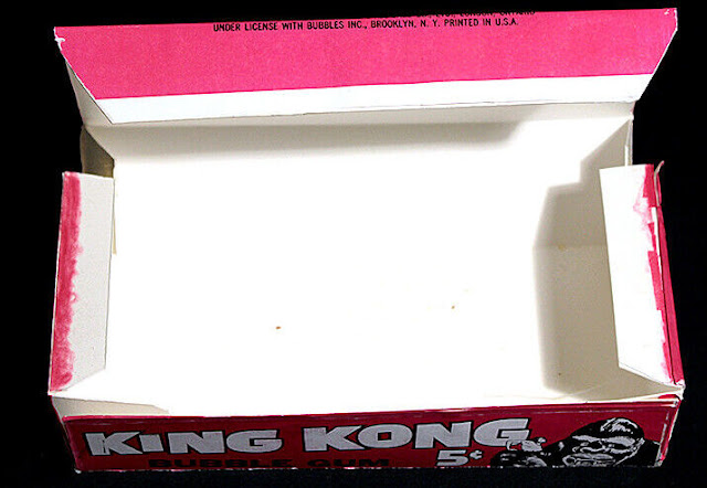
Another proof for sure given the back and one I think was issued in 1965. That some front font returns for King Kong, a set that may be from 1965 or 1966 but was never really issued as the project went to Donruss instead. Here, lookee:

A small logo has been added here but the font remains the same. Thanks to a newfound interest in Japan, where the big gorilla was first paired with Godzilla in 1962 and thereafter the original film was broadcast so often on TV back in the 60's and 70's that is might as well have been a recurring show.Kong was as big a staple on Thanksgiving as cranberry sauce and pumpkin pie and the kiddies (and their parents) ate it up, making it a field for mining licensing gold.
The back uses the same font for the caption and adds a line drawing that in this case mirrors the front picture (a happy coincidence for #48):

The 1965 date is an RKO copyright for the licensing purposes but it looks like Topps had right of first refusal on images from the movie and there is a production number on the box (one of the first ever) that gives a 1966 issue date for the cards. Let's look at another, similar and yet at the same time dissimilar issue, 1965's (and possibly 1966's or even a tad later) Superman:

What a great shot! Superman was re-syndicated in 1965 and approximately one zillion kids grew up with the reruns just as Topps was starting to grasp the impact of the boob tube on the boomers. Meanwhile, back in Metropolis the above front design mimics the look of the '63 Beverly Hillbillies cards in the use of an oval to contain the caption while the font is similar to those used in the other B&W sets. The back caption uses the same font as the front:

Note also how the image of the set's subject, a photo in this instance, is offset against a block of text, just like the King Kong issue. The above Superman card was a test issue; the regular issue would pull together another design element from the Beverly Hillbillies on the reverse.
First, a regular issue front, not as clear as the test issue, which was very sharp but otherwise the same:

The back though, adds some familiar color for the "real" set:

The back is a little brighter than the Hillbillies back but that color was a favorite of Topps throughout the Sixties. There is also a back variant:

Despite the 1965 copyright from National Periodical Publications, I wonder if the "Watch Superman on TV" version of the set was actually a very early1966 issue with Topps testing the market in late '65 on the earlier and very scarce test issue.
The addition of the copyright date after the test issue is just a bit odd and maybe I'm interpreting it wrong but it smacks of some legal maneuvering, very possibly to
keep the actual creators of Superman from realizing any profits from the syndication of the show. Any legal wrangling could have delayed the nationally released/revised copyright set into 1966.
The font is italicized in the bottom tag line (and replicated also on the reverse of a colorful, non-TV issue called Superman In The Jungle) segueing nicely into the mysterious Flash Gordon set, a super tough issue from Topps that
did not see normal distribution:

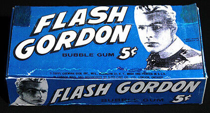
Re-syndication, this time in 1966, seems to have led to Saturday morning TV glory for Buster Crabbe. I am not sure if the latest Superman issue predates ol' Flash but the italicized font clearly flows smoothly from one issue to the other; just whited-out inside a black bar with a logo (like Kong) at the left for effect on the Flash Gordon cards. The logo refinement and inside out White and Black lettering would be mimicked in later sets but check out the back:

The primary back color is salmon and there can be more orange-ish hues like the Superman reverse but this color scheme was a Topps favorite in the mid-60's. Familiar font, text block and offset drawing too, no?
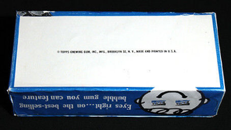
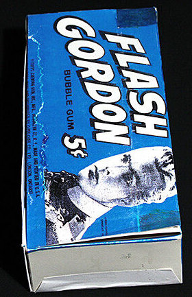
Flash is very much tied to King Kong but I wanted to show the progression of the common design elements from King Kong through the Superman issue and then to Flash Gordon. I believe this to be a 1966 set due to the re-syndication date and the fact it shares display box design elements with the King Kong issue. It was however, likely
reissued in fun packs in 1968.
There is no indication the King Kong cards also made it out of Duryea in similar fashion but it is highly likely to my mind as Topps seemed to be clearing out space in the late 1968 to early 1969 period and some tough football issues were actually found in the town dump around this time! A warehouse sweep and dump into fun packs would have been very much in character at the time before the final ignominy of a set being thrown out by its maker occurred.
Next time out I'll look at more similar B&W issues, so stay tuned! By the way, some of the scans up above were liberated from
www.horrorcards.org. Go give 'em some love!