Way back in 2008, almost at the start of this blog, I posted a super short piece about some Topps mockup creations that had been featured in a Gavin Riley Baseball Card News article in the mid 80's. While I've posted at length about these and other mockups that have popped up in auctions over the years, one specific example has has stayed out of sight until recently and it features a huge name in Roberto Clemente.
Heritage Auctions had it on the block recently and it's thought to be a 1972-ish creation of the Topps New Product Department. Here it is:
Some press-on letters, a pasted-up Pirates logo and some overlaying of of a border on an image of Clemente -
voila! This is a nice one as such things go, many of these are not as neat and feature made up names, or those of Topps employees. The advanced look here - there's also a layer of what's described as "thin plastic (which is likely celluloid) - covering it makes me wonder if this made it through the review process a little farther than most.
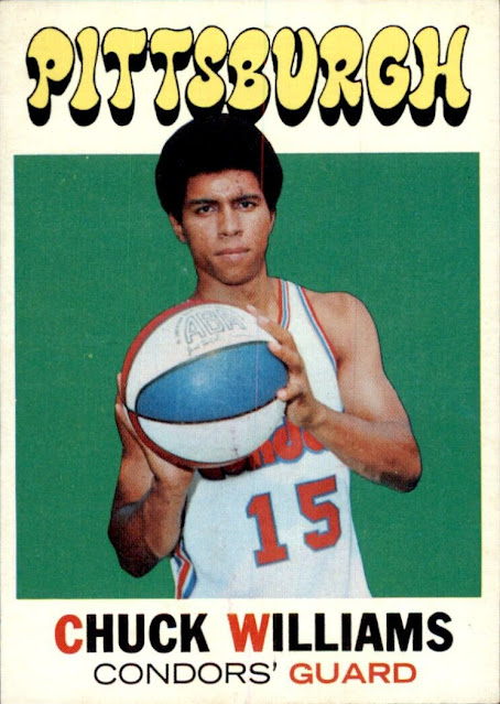
The Pittsburgh name at the top uses lettering reminiscent of the 1971-72 Topps Basketball set, although it's not as "mod" in appearance:
It's affixed to a fairly larger bit of illustration board which I've rotated ninety degrees for easier reading of the non-essential verbiage on the back:
I'm hopeful some more of these Clemente-styled mockups will be uncovered some day, I like the design!


1 comment:
I remember both articles. I was also very excited to see it show up. I was even more excited to win it!
Post a Comment