Tuesday, March 29, 2011

Circular Logic

As Steve Martin used to say: "let's get small, real small." As faithful readers of this blog know, probably ad nauseum by now, most early Topps gum products and inserts were quite small, especially in 1948-49, measuring about 7/8" x 1 7/16" at their tiniest. Well lurking on some of the wrappers for these issues is something even smaller.
Link
I first noted today's quarry on a Stop Go wrapper, which would have contained a 1949 License Plate card:


If you look at the upper right portion of the opened wrapper, which is made of very thin paper, on the flap there is a small circle that would have been hidden from view when the pack was sealed. This little circle contains three initials: LBP. Here, take a look for yourself; I made a high-res scan of it:


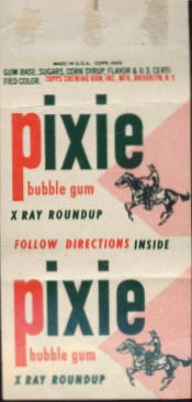
It took me about three seconds to realize these initials stood for Lord Baltimore Printing, a known producer of the 1954 baseball cards and probably the main printer for Topps until the middle to late 1950's (still working on that part of it folks but they ran off quite a few sets for Topps). I checked a scan of a Pixie Bubble Gum wrapper (not mine) which would have held an X-Ray Round-Up card and found another circle.


Yup, there it is, same spot but in red:


Sorry, that's way blurry but I can't really get it to resolve any better. However, I found another Pixie wrapper without the logo. That wrapper may have been from a second series pack as it was shown with two cards numbered above 100 but I can't say for certain:


(http://www.scottsdalecards.com/catalog/)

It could have been ripped off when the package was opened and it adhered to the other side but I don't think so. Then I noticed it gracing a 1948 dated Magic Photos wrapper (which states Hocus Focus but held Magic Photos:


Same spot, again in red:


I have not been able to spot the underbelly of a 1949 Magic Photos penny wrapper (which may have been used for the second series),nor have I seen the if the World Coins wrapper has it. Varsity does not, at least on this example:


And I can't tell on this Parade wrapper due to low resolution. If it's there it's dead center on the flap:


I also need to see a '48 Tatoo wrapper but am not certain if they were paper. The larger-sized sets from 1948-49 such as Golden Coin and Flip-o-Vision had a different style wrapper that was probably not made by Lord Baltimore Printing. I think it probable the early non-paper wrappers were a Wisconsin product and there is another story or two there someday buckaroos!

I think the little circle is a clue actually and that it appears on the earliest penny tab issues. Tatoo was probably the earliest of them all but as noted above, I need to sight and feel a wrapper. Magic Photos was likely the next small card set issued, followed by X-Ray Round-Up from what I have been able to determine. The License Plates were probably a little bit later, just before Varsity, which would have been late summer or early fall issue. World Coins probably came after Varsity so my guesstimate is that it does not have the LBP logo. Its also possible Topps switched printers or used more than one for some sets.

So, did the circle disappear sometime between Series 1 and 2 of X-Ray Round-Up? I'll take any and all scans for comparative purposes folks, so send 'em if ya got 'em.

Saturday, March 26, 2011

How Striking

Well once again I was going to post one way and have ended up posting another. Ah......

Topps released their first football set in 1949, a set of 100 small felt back cards that came inside penny packs of Varsity bubble gum:


I've shown the cards before but here is a front and back; the back was made of "felt", I guess to mimic a true pennant:


I am not here to dissect the set, that will be done another time. What derailed me today though was this scan:


The matchbook advertises the All America Football Conference, a competitive league that gave the NFL some headaches from 1946-49 before having some teams absorbed. One team that did not survive was the New York Yankees, itself an amalgamation with the old Brooklyn Dodgers team that found itself playing in Yankee Stadium in 1949. The Topps advertising is interesting but seems misplaced as it looks to be promoting the penny gum tabs that were still popular, albeit fading, instead of Varsity bubble gum. The "Don't Talk Chum, Chew Topps Gum slogan"was hanging on though.

The matchbook must have been produced before the season began as the six home games for the Yankees were their full slate. I can only think since the Varsity cards depicted college players, Topps did not think there would be enough interest among fans of the pro game to market their cards to the AAFC crowds, or perhaps the crowds were not too large. Anyway, I thought it was a neat item to share today.

Wednesday, March 23, 2011

This Year's Model

I don't even know where to begin with today's entry. In 1970 Topps issued a set of small, plastic toys called Mini Model Cars:


According to Chris Benjamin's Sport Americana Price Guide to the Non-Sports Cards Number 4, there are twelve cars in a complete set but I frankly have no idea if that is true. The back of the pack shows what was in store for the lucky purchaser:


The cars were made in Hong Kong and the packaging, which is a paper envelope measuring 2 3/4" by 4 3/8" with flaps on each end held a mini car on a sprue that measures 1 3/4" x 3 1/2":


That windshield is not brown but rather has a weird translucence like certain areas of the 1968 Baseball Plaks. Unlike the Plaks though, which were fairly thick, the model cars are made of flimsier material. This particular model has number 22 on the hood:


The cars came packaged with a very thin insert card, or rather one of two types of insert cards. The cards that make sense are called Racing Track Cards:


The back indicates 21 were in the set and obviously they made up a race track for your mini cars:


The cards are oddly sized at 2" x 3 5/8". You can see one of the two dimples on the card (caused by the main body pieces of the model) in the back scan. The box advertised the fact you could make a starting grid, as Topps put it:


Here is a full box flat from the wonderful norman-saunders.com site:


Here is an interior shot of a box from an Ebay auction a while back:


Now, the weirdest part of this whole thing though is that certain packs held something called Soda Fountain Car cards. The only place I have ever seen a picture of them is from the aforementioned Sport Americana Price Guide to the Non-Sports Cards Number 4 by Chris Benjamin:


Twelve in number, the card front would have been in color. If you take the 21 Racing Track cards and add them to the 12 Soda Fountain Car cards you get 33, which is a total used by Topps quite a bit for their insert and oddball sets and is divisible by that favorite Topps number, 11. Why Topps had such strange cards as inserts beats me; it seems there was to be a set of soda-fountain cars issued as well that was scrapped. It looks like the kid in the above scan has an ice cream sundae on the seat next to him and they are both situated behind a windshield.

The mind reels at what those would have looked like in plastic form or why they even were contemplated. The only thing I can think of is that the Brooklyn property the Shorin's once lived on around the turn of the century (that's the 19th century turning over folks) when the four eventual Topps founders would have been very young, featured a converted saloon that was, yup, a soda fountain. Other than that, I have no idea what was going on.

Saturday, March 19, 2011

Promotional Considerations

I was flipping through the second chapter of the Great American Baseball Card Flipping Trading & Bubble Gum Book


this morning and noted a comment by Sy Berger that he had been originally hired by Topps to run a special promotion. Well, I said to myself "Self, it would be a fine thing to find out what that contest was." As it turns out, I already knew the answer but didn't realize it.

Friend o'the Archive Jeff Shepherd regularly sends along batches of scans for me to peruse. They are quite useful in researching the early history of the company and in addition to being fun to read are great fodder for illustrating blog posts here. Shep had already sent me a letter that revealed the answer:


Sadly the letter is undated but Sy Berger is clearly shown as the Contest Director for a promotion where a silver dollar was awarded to the winners of a contest relating to Tatoo Bubble Gum. It's hard to be sure but it looks like the contest involved sending in suggestions for the next series of Tatoos. A separate contest for Bazooka is noted in the letter and names were being solicited for a mascot. I believe the winning name was Bazooka, the Atom Bubble Boy.


Bazooka Joe was still a good half-decade off. That scan is from the awesome Comic Book Hall of Fame site.


(From Non-Sports Archive by Adam Tucker)

Tatoo may have been the first Topps penny gum product sold with a novelty and designed for kids-Bazooka was originally a five cent confection. First issued in 1948, it was reissued in 1949 and again in 1953; packaging differs slightly among the three. The first run in 1948 purportedly had 100 different subjects and came in an innovative package called a tourist pouch (color scan needed, big time). The ins and outs of these sets are for another day's post though; it gets complicated. Here is some original artwork from the set for a Buck Rogers inspired tatoo:


There would have been some color added to the final tatoo. I'll get some scans together and do a full writeup on these someday. As for Sy Berger, I think the contest went well, since he spent the next 50 years working for Topps!

Wednesday, March 16, 2011

Quality Was Job One

Seeing how I showed a slew of old Topps gum scans from the 30's and 40's last time out (wrappers and yes, gum) , I feel it's time to share two scans sent by friend o'the archive Jeff Shepherd that give a glimpse as to how Topps marketed their products in the very early days. Topps upper management, which was dominated by the Shorin brothers in the first twenty years, did not leave anything to chance. They paid for third party market research and they also paid for some high quality advertising.

This ad sheet would have been handed out at various confectionery trade events and conventions and may date from 1938 or '39:


I love the noir-ish, deco-ish look to the ad; it's a very well executed piece and brings home the fact the gum was being marketed to an adult crowd originally. The back is more prosaic:


As readers of this blog know, 60 Broadway was where Topps first set up shop in Williamsburg, Brooklyn. The building was known as the Gretsch building, built in 1915 and rehabbed around 2005 into an ultra ritzy condo building. The text really leads me to believe this ad sheet dates right from the startup of the company, although it's possible it was just a little bit later on if over the counter sales of the gum came first.

Topps used the distribution channels established by American Leaf Tobacco Company, another Shorin family business, to quickly establish a national presence for their gum line. By 1940, as we have seen previously, they were well distributed nationally and were about to contract with the US Government to provide gum for military field rations. The 1940's were very good indeed to Topps Chewing Gum.

Saturday, March 12, 2011

Thoroughly Ripped

So I got this innocuous e-mail yesterday from friend o'the archive and online buddy Shane Hardie, asking me to take a look at some 1960 Topps Baseball Tattoo scans. That was about six hours ago and I lost Saturday afternoon to the quest!


Long story short, Shane has a theory that the little rips that appear at the top of each tattoo were not the result of the pack being opened but rather a production mark. Here is a closeup:


Shane noticed that when you looked at an unopened tattoo that the rip was already in place and neatly hidden by a flap of the wrapper from the other end when folded on the production line. Well, I happen to have a few pieces of unopened Topps gum from 1946 in my collection and I poked out the foil wrapped gum on a piece of Peppermint


and could see a little rip on the interior of the wrapper, covered by the flap from the other end. I then opened a piece of Spearmint


and observed the same thing. Here is the Spearmint from the other side:


My first thought was that the little rip was caused when the wrappers were cut by Topps on the production line but a closer look revealed the foil wrapped gum tab had a corresponding notch in the same location on the Peppermint:


That little round dot below the rip also penetrated to the other side of the interior wrap


It's hard to see but it's there. It's also on the Spearmint tab but much fainter and it does not present well so I've left it out of the pictures here. It's impossible to make it show up on a scan but the gum tab also had a slight depression in the same spot. Here is some 65 year old gum for your viewing pleasure:


I was tempted to chew it but thought better of it. The score line actually appears just to the right of the rip on the example above (where the foil is still folded). I suspect it was the result of a pin holding the wrapped tab down to secure it before gluing.

Other wrappers share the rip as well. here is a 1949 Stop n Go pack that held a license plate card:


There's another goodie on the flap, I'll get into it next time. Here's a couple from Chris Benjamin's Non Sport Guide:


To top it off, here is an OPC Football Tattoo from 1960, also with the rip:


That would mean that Topps either imported the Football Tattoos into Canada or that O-Pee-Chee used the same equipment as Topps.

I think Shane is right-the rip is the result of the production process and not caused by the opening of the pack. Topps used the same equipment for a long time it seems; here is a 1939 wrapper with the same rip, sent to me by friend o'the archive Jeff Shepherd:


That one is pretty pronounced and you can see the white area where the glue must have gone to seal the flap on top of it. The 1964 Baseball Tattoos also have this rip:


I can't find any scans at the moment but Topps last penny tattoo issues in this style were 1967's Dr. Doolittle and Comic Book Tattoos, although they issued a non-tattoo product the following year called Magic Funny Fortunes. I'll try to see if those have the rips; if they do it mean Topps might have used the same packaging equipment for thirty years! In 1969 Topps went to an accordion style tattoo sheet that sold for a dime so maybe that's when they upgraded their machinery, although one would think the 1966 move to Duryea, PA would have resulted in gleaming new production equipment.

I wonder if this post will cause a "flap" over the rips?

Thursday, March 10, 2011

Fuel For Expansion

A couple of posts ago I delved into the early history of the Shorin family and American Leaf Tobacco Company (ALTC) as a followup to my article in Wrapper #257. Therein I mentioned that in addition to the more well known ALTC, the Shorin's also owned a chain of gas stations in Brooklyn in a period roughly spanning the Depression. The chain was called American Gas Stations and the company was founded in 1928.

American Gas Stations (AGS) may have had the financial backing of Morris Shorin but it appears his youngest son, Joseph, who would have been about 25 at the time, was in charge. Joseph Shorin would eventually end up being President of Topps Chewing Gum but he had the benefit of the decade he spent running AGS to draw upon. Joe Shorin graduated with a degree in Business Administration from New York University in 1925 and attended St. Lawrence Law School, which despite the Canadian sounding name had a branch in Brooklyn at the time.

Information on the company is scant but I suspect it was set up as a partnership. The first location may have been a couple of blocks north of Ebbets Field at 1619 Bedford Avenue in Brooklyn, which ended up as the eventual headquarters of the whole operation. Here is a matchbook showing their logo and some gas station addresses:


(Scans courtesy of Michael Moran)

I've never been able to find an American Leaf Tobacco Company logo but wonder if it had the same red, white and blue color scheme. It would make sense.I'll get to the locations in a minute but take a look at the logo first, which is highly stylized and slyly incorporates the initials of the firm:


I was able to determine two of the locations shown on the back of the matchbook were purchased in early February of 1938 by AGS. By the time Joe Shorin sold the company to Socony-Vacuum (later Mobil) in 1939 they had seventeen stations so they were snapping up locations at a pretty good clip in '38. I am still doing research but the sale of AGS seems to have been initiated by Socony-Vacuum.

The American Leaf Tobacco Company was sold just prior to AGS I believe and while I do have some details on why I think ALTC was sold and did not wither away in the depths of the Depression, I will save those comments for another time.

Joe Shorin was knocking down whatever existed when he purchased his properties for AGS and building a distinctive style of building for each station; red brick with white trim was the color scheme and I have to think a touch of blue would have shown up somewhere in the design. I am told they were quite easy to spot back in the day. One AGS station still remains, at 1815 Ocean Avenue between Avenues M and N, although it has been painted over and is now called Tomat Service Center (NOTE 11/19/12-it appears to have been torn down and replaced with a Sunoco storefront):


View Larger Map

More pre history of Topps to come folks!