Saturday, December 30, 2023

English Language Barrier

I used to frequently travel to London on business and would often marvel at the differences in phrases and words used to describe things when compared to comparable US jargon. In England, you don't have a backyard, you have a garden.  The Underground (aka the tube) is a subway in the U.S. and a subway there is a passage here. Crisps are chips and chips are fries, etc.  So it's no surprise that the English licensee and trade partner of Topps, A&BC Chewing Gum, sometimes used different nomenclature than their U.S. counterpart for similar products.

Take, for example, this 1965-ish A&BC Picture Card Album scanned by Friend o'the Archive Lonnie Cummins, which housed a youngster's Man from U.N.C.L.E.  card collection:


Props to the kid, as he properly put the periods after each letter!  A&BC (or, speaking of periods: A.& B.C.) was on board as well! Note how the album doesn't  have a glossy cover, just a cheap pulp one like the rest of the kit. That album-mounting lad is a somewhat, albeit not exactly, familiar image, seen here around 1956 in the U.S.:


And again a half-decade later, slightly livened up:


A&BC did issue an album that matches the US one above, slick cover and all (every A&BC album scan is from Lonnie going forward):


So what was a "Picture Card" album in the U.K. was a "Hobby Card" in the U.S. of A.  

The inside front cover was pretty informative.  Footballers and Cricketers would be pretty much foreign phrases to most American kids in 1965! Heck, even soccer was not all that well known at the time.


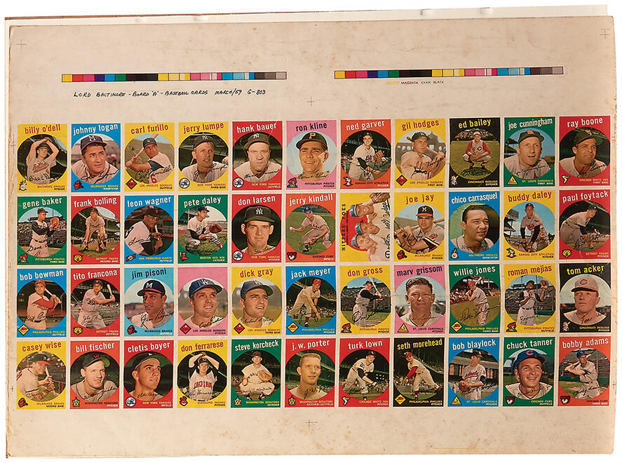
Here is a Cricketer example from 1959; A&BC issued another set in 1961 as well but for sheer poetry on a card, 1959 is the most Larkin-esque for sure:


The counterpart to cricketer in the US is "baseball player" which seems easy enough but take a look at the back of this card as it's illustrative of just how different things can be across the pond:


OK...England & Middlesex means he played for the National English team plus his "regular" club. And "over" is the delivery of six consecutive balls by the bowler.  "Bowler" is kind of like a Pitcher, except everything they deliver would be a balk on a baseball diamond, sort of . A "maiden" is a positive measurement but can mean a couple of different things and "Baseball Annie" is NOT equivalent! A "Wicket"...oh forget it, just take a look here, not that it will help much! 

Did I mention the 1961 issue was to commemorate a "test series" and that they can run up to five days? Well, it's nice enough anyway:


A&BC also offered "bespoke" albums for some sets, including one of their very earliest in 1954:


Flags Of The World also saw one, I believe from 1959, when the set debuted in the United Kingdom, although I note it was reissued, with smaller dimensions, in 1963 so either year is possible:


I suppose I shouldn't post this one but when you can get 7 cards for 6d (that's six pence, which we would call a penny in the states) it seems like a steal!


Plus there was a cool looking album!


Well all this typing has made me hungry.  I'm off to rustle up some biscuits, err.....cookies!

Saturday, December 23, 2023

A Yaz By Any Other Name

Some nice prices were recently realized in a recent auction or two over at Heritage for a couple of prototypes that were created as the 1968 Topps 3-D Baseball set  was being developed and, while I don't typically focus on values here (and also discussed some of these about three months ago), it seems instructive to do so here.

This example of the Brooks Robinson prototype, which has a tear at the bottom, is now in a PSA Authentic slab and went for a cool 60 Grand:


I believe that is a record for this card, where a mere handful exist, with a definite upward trendline on pricing. Also of note, was $21 K for this nom-de plumed Yaz in the same auction:


It too now resides in an Authentic slab, SGC in flavor. That is likely the first recorded sale for this one. 

Meanwhile, the Roberto Clemente prototype I discussed here only last month, went for a paltry $3,145.20:


Granted, it was on illustration board and a mock-up vs. a  mostly finished prototype, I think it went w-a-a-a-y cheap, especially considering Clemente's staying power in the hobby marketplace.

The 1968 3-D's clearly remain popular, whether they are are proofs, prototypes or actual issued cards. Whether or not the more esoteric mockups and the like from other sets will catch up remains to be seen but as prices move up for the 3-D's production materials, I suspect that will raise the price of other such items as well, at least for Hall-of-Famers.

Happy Festivus!

Saturday, December 16, 2023

Whoa, These Chains Of Love

I ran across a neat proof sheet the other day of sixty percent of the 1964 Topps Beatles Plaks set. You may or may not know about these as they were an obscure issue from day one. 


It looks like the cards would get a true wavy edge cut, like a handful of other Topps issues of this ilk had (including a smallish-sized set or two made of actual wood) but there was something even more detrimental involved.

Easily the toughest of all the Fab Four sets disgorged by Topps in 1964 and 1965, these somewhat sturdy cards had an interesting feature that allowed them to be connected one-to-another in order to form a chain of sorts. You can get the gist of things pretty quickly; check out the scored areas top and bottom:


So right away you can see wear to the little score lines at the bottom.  Well, it actually gets worse-check out the instructions:

Yes, Topps wanted you to destroy the top portion of the card, so there's at least three things working against these condition-wise: size (a normal 2 1/2" on the short end but 4 11/16" on the long), scoring, and tearing! They also appear to have been limited release, so you've really got a fantabulous nexus of things going on here.

The retail box gives you an idea of the "post-mohel" scenario: 


Wrappers are tough to come by, even given the relatively tough cards:


I find the cards to be the nicest of the five Beatles issues put out by Topps.  They also licensed, but ultimately did not produce a set, for Yellow Submarine.  Given the array of underground artists illustrating for them when the movie came out in 1968, that could have been a mod psychedelic wonder!


Saturday, December 9, 2023

Tickled Pink

Friend o'the Archive John Moran recently pushed some 1959 Topps Baseball partial proof sheet scans through to Net54 Baseball, where a clutch of dedicated sleuths are piecing together Topps press sheet arrays (i.e. the A &B slits) for the years covering 1956 to 1969 (and maybe a little bit on either side of that). I'm not here to steal their thunder but one of the scans posted there had some really interesting details that are not often seen on the partial proofs that have entered the hobby over the years:


You can plainly see this was a Lord Baltimore Press production. Also quite prominent are the color keys and some alignment crosses at left, center and right (The crosses are also visible at the bottom).

I'll blow up the entire left side waste area above the cards and below the key to make the discussion easier:


I often talk about blocks of cards on a press sheet being arrayed in an ABA/BAB pattern across the two slits when an 88 card series was being printed. Each letter represent the same 44 card block on the slits, but the Board "A" reference is merely coincidental here (I think) as Topps also would prepare and proof their art work in batches of 44 (or 55, 22 or even 33), depending upon the configuration of the series being printed. I assume this is because each slit had at least one batch on it and they could move around the films shot  by the printer or each accordingly. You can see the proof date, or at least the month (March) and what I assume is a batch order number (6-803) or some other such reference. It's not clear to me if that's a Topps notation or one from LBP but I suspect the latter.

The cards on the A Board run from nos. 201 to 285, entirely consistent with a 110 card first series, followed by two series of 88 cards each.  It's a little weird that Carl Erskine's name does not appear on the proof. I know he voluntarily retired on June 15, 1959 so the printing predated that but occurred during spring training.  Perhaps he was contemplating retirement before the start of the season and caused Topps some pause? Or it's just a goof-up.  Here's the finished card:


Board B would have had the other 44 cards from the series, including Fence Busters (with Ed Mathews and Hank Aaron), Early Wynn, a couple of team cards, a second year Maris and some not-so-hot rookie cards.  Kind of a meh series overall, talent-wise, isn't it?  In fact the whole set only has a couple of big name cards but it's a release that I've always liked the looks of thanks to the big blocks of color and well-designed backs.

So a neat little bit of Topps printing history there-too bad there's no complete record but of course, what else would those of us who dig this stuff do if there was?

Saturday, December 2, 2023

In Like Flynn

I've briefly mentioned Art Flynn Associates a couple of times here, as they were one of the firms used to procure baseball player contracts for Bowman, possibly the only one. In particular I have written about Joan Crosby, who covered Philadelphia and New York for the agency.  Being a woman, she did not have locker room access, which was only something that came to pass in the 1970's but it didn't seem to hold her back in terms of signing up players. But baseball was far from Art Flynn's only area of endeavors as the firm represented a wide range of sports figures, covering an impressive array of athletic pursuits.

Love of the Game Auctions recently offered a promotional flyer from the firm, which is a wonder of  casual sexism and hero-worship well worth a gander.  Here's one side:


The number of athletes who endorses cigarettes was probably still peaking toward an all-time high in 1947 when this flyer was prepared. Check out the upside-down group seen above:


Starting in the upper left we have Bobby Riggs, seen here in one of the funniest moments in the hilarious history of the Odd Couple:


Riggs is followed, in a counterclockwise fashion by Sid Luckman, golfer Lloyd Mangrum (winner of the 1946 U.S. Open), Stan Musial, Ted Williams, Nat Holman (a famous basketball player then coach who would later be tainted, perhaps unfairly, by scandal), and swimmer Adolph Kiefer (who won a gold medal in the 100 meter backstroke at the 1936 Olympics). Kiefer's presence may have had more to do with his prominence as a businessman than athlete at this point, although he was possibly just as well  known at the time as the man who taught Navy cadets how to swim properly during World War 2.

Here's the ad as it appeared around the country:
 

The list of sports in the flyer was quite varied and in addition to the ones represented in the Chesterfield ad, there were folks from: speed skating, polo (!), badminton, table tennis, figure skating, bowling, billiards and boxing.  They even threw in some theatrical types such as Bojangles Bill Robinson and Hoagy Carmichael. 

Television had not yet supplanted radio, that was still a couple of years off, but it did get an oblique mention:

"High-Hooper" refers to perhaps the preeminent service (Hooper) that was measuring radio ratings at the time, along with Crossley and Nielsen. The 1947-48 radio season would prove to be the highpoint in terms of advertising dollars spent on the medium before television use exploded.

Did I mention casual sexism and hero worship?

The Lifebuoy, Gillette and Chesterfield ads are so prominent, I suspect Art Flynn was able to leverage their co-op advertising into a greatly reduced printing bill.

I'd be remiss if I didn't include one of the Gillette cartoons before I go:


Frank Williams, if you're wondering, was the editorial and sports cartoonist for the Detroit Free Press from 1943 to 1978. Ya gotta look sharp!

Saturday, November 25, 2023

What In The Sam Rosen Is Going On Here?

I was rolling through images on my hard drive the other day and pulled up a sell sheet from Sam Rosen (the antecedent, as a business, to Card Collectors Company and also the step-father to Woody Gelman) that had some curious series breakdowns for the the 1958 Topps Baseball set. The '58 set is a weird one as Topps was dealing not only with major league expansion to the west coast but also expansion of their signature annual set by 88 cards over the high of 407 cards they issued in 1957, tying it with 1952 as their most prolific at the time. Mix in their first All Star cards, the yanking of Ed Bouchee's card at #145, in-series checklists (ordered, for the most part, both numerically and alphabetically) and the much-ballyhooed signing of Stan Musial and it's clear Topps has a lot going on sixty five summers ago..

But I'm not sure what can explain the series pricing for the set sent out by Rosen in July that year:


Rosen seems to be referencing single and double prints in his pricing but they seem way too neatly divided to really reference the vagaries of the usual 132 card A&B slit printing impressions for each specific tranche of cards.

Compare the above to the way the numeric checklists lagged things vs. how the press sheets were run off for each series and you can see an interesting pattern pretty easily:


That was a fairly common structure with Topps for a spell, here with a 110 card first run, followed by three runs of 88 and what may have been intended as a final run of 66 before the 55 high numbers got the green light. Yes, the 22 card lag over the four initial series is reflected in Rosen's pricing structure, which also suggests a 3:1 ratio as well, Extra Print vs. Short Print. But those 88 and 66 card series really imply the cards should  have been printed in the same quantities.  And the 110 card first series essentially has 44 overprints if things were handed the way I suspect they were. And what is going on with the first 88 cards, where the pricing structure is an imposing 4:1?! 

Well, for a long, long time it was thought the first series was more like a traditional high number series, where less cards were printed than in all other series but pricing and population trends over the last couple of decades suggest pretty much all cards in the set are equally available, in one of the smoothest distributions ever pulled off by Topps. They likely learned from it though, as the high numbers get tough again in 1959 and we start seeing semi-highs with some reduced numbers as well. But I wonder if this was the start of the idea the cards in the first series in 1958 were scarcer began?

The one slit I have seen for series two has a classic set up, imagining 44 card blocks, of A B A, that suggests the other slit as B A B (noting Jim Bunning was slotted in to take the place of Bouchee as an off-the-cuff Double Print):


So either Rosen was pulling a fast one, made a mistake or got some bad intel from his stepson. It's certainly clear today that the precise divisions from San Rosen's price list exist. But it just seems odd, supremely so, that this was how Sam was selling the set in 1958.


Saturday, November 18, 2023

Fertile Crescent

Way back in 2008, almost at the start of this blog, I posted a super short piece about some Topps mockup creations that had been featured in a Gavin Riley Baseball Card News article in the mid 80's. While I've posted at length about these and other mockups that have popped up in auctions over the years, one specific example has has stayed out of sight until recently and it features a huge name in Roberto Clemente.

Heritage Auctions had it on the block recently and it's thought to be a 1972-ish creation of the Topps New Product Department.  Here it is:


Some press-on letters, a pasted-up Pirates logo and some overlaying of of a border on an image of Clemente -voila! This is a nice one as such things go, many of these are not as neat and feature made up names, or those of Topps employees. The advanced look here - there's also a layer of what's described as "thin plastic (which is  likely celluloid) - covering it makes me wonder if this made it through the review process a little farther than most.

The Pittsburgh name at the top uses lettering reminiscent of the 1971-72 Topps Basketball set, although it's not as "mod" in appearance:


It's affixed to a fairly larger bit of illustration board which I've rotated ninety degrees for easier reading of the non-essential verbiage on the back:


I'm hopeful some more of these Clemente-styled mockups will be uncovered some day, I like the design!


Saturday, November 11, 2023

Come Sail Your Ships Around Me

We're off to the high seas todays matey's, as we take a look at the waterborne portion of the 1955 Topps Rails and Sails set. As we all know, the style of paintings is a bit more in the tradition and style of nautical art and these more resemble pieces you might see in a museum or gallery, with full bleed borders aiding and abetting that look. As with the Rails, some Sails art has popped up over the years, here's one of the most famous subjects in the set, the SANTA MARIA:

As with the Rails, the level of details can be stunning.  Is that Cristopher Columbus near the bow?  Here's the finished card:


It's a little darker than the original as Topps essentially muted the brightness of the artwork in production.  The card back, to me at least, shows just how invested Topps was in the set, which was the last of their three great Giant Size transportation themed sets, namely Wings in 1952, World on Wheels in 1953-54 and then Rails and Sails in 1955. I can't prove it but suspect the latter two were designed as hopeful "Bowman killers" in a way.  Check it out:

There is a lot going on there! You get some useful information on flags used by vessels to communicate with each other at sea in the time before radio, a look at a lighthouse (the lighthouse tour was part of many of the Sails cards), some excellent text and a nice nautically-themed card number icon with an anchor and stock. Can you imagine taking on the open Atlantic in that tiny vessel during hurricane season?!

Here's another original illustration, it's subject is a bit more modern than the SANTA MARIA and that may reflect the fact it details a Submarine:

The muted color palette has been tossed out for the original illustration and it's kind of James Bond-like in a way, but almost ten years earlier that the movies. Hold on though, the printed version has had the color tamped down:


This one has some Dutch Navy details that don't follow the modern theme of the card (none of the illustrations in either Rails or Sails really matched the fronts) and a neat Sea Myth offers some weirdness:

There's even more to the set and I hope to get into that pretty soon sailors!

Saturday, November 4, 2023

Tell Me How Long The Train's Been Gone

On the heels of last week's Rails and Sails post, I thought I would share some artwork scans from the set. Despite the mismatch of styles for Rails versus Sails, I consider this set to be the apotheosis of the Topps Giant Size Non-Sports cards. The artwork on the front of the cards is often stunning, always well-executed and there is a wide range of subjects in both look and time.  Then there are the card backs, which were so well thought out and colorful for both modes of transportation.  I imagine it was was fairly time-consuming set to create and may have been a little expensive as well, although if it was, had more to do with the backs than the fronts I'd say.  The artwork was paid at per-the-piece rates of the day but some of the Rails copy (and/or possibly stock photographs used for the illustrations) came courtesy of American Car & Foundry and I suspect Topps may have had to pay for it.  Not all of the Rails cards carried  "Courtesy A.C.F. Industries Inc." indicia of course, some were from foreign railroads or, obviously, not manufactured by ACF.

The original art has bubbled up in a few batches over the years, mostly around 15-18 years ago with some "finds" larger than others.  Today I want to ride the rails portion of the set and here's a great-looking original, which is the Casey Jones' Loco operated by the Illinois Central Railroad:


Here's the finished card:

Sweet, right?  Here's the reverse where you can see what I mean about the design:


Beware of snake heads-yikes! And dig the rando locomotives and cars used for the main illustration running on the tracks along the bottom.

For the record, here's how the ACF indicia looked:


Here's a piece of art offered by Heritage sometime back, the level of detail is astounding:


Card no. 109 for those keeping score at home:


And here's a true production piece:


It's not no. 48 though, as marked, but rather no. 33:


The handwriting on the back seems to be instructing the illustrator on the various colors, indicating the source was a black and white photo; that's how things rolled back then!

Back with some Sails art next time kids!