Saturday, November 25, 2023

What In The Sam Rosen Is Going On Here?

I was rolling through images on my hard drive the other day and pulled up a sell sheet from Sam Rosen (the antecedent, as a business, to Card Collectors Company and also the step-father to Woody Gelman) that had some curious series breakdowns for the the 1958 Topps Baseball set. The '58 set is a weird one as Topps was dealing not only with major league expansion to the west coast but also expansion of their signature annual set by 88 cards over the high of 407 cards they issued in 1957, tying it with 1952 as their most prolific at the time. Mix in their first All Star cards, the yanking of Ed Bouchee's card at #145, in-series checklists (ordered, for the most part, both numerically and alphabetically) and the much-ballyhooed signing of Stan Musial and it's clear Topps has a lot going on sixty five summers ago..

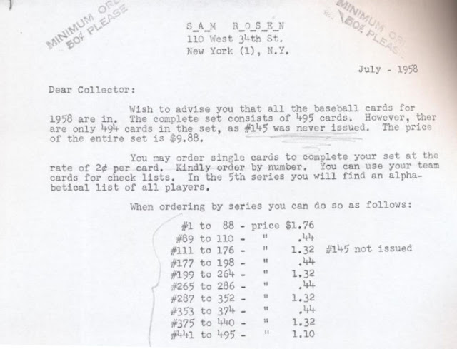
But I'm not sure what can explain the series pricing for the set sent out by Rosen in July that year:


Rosen seems to be referencing single and double prints in his pricing but they seem way too neatly divided to really reference the vagaries of the usual 132 card A&B slit printing impressions for each specific tranche of cards.

Compare the above to the way the numeric checklists lagged things vs. how the press sheets were run off for each series and you can see an interesting pattern pretty easily:


That was a fairly common structure with Topps for a spell, here with a 110 card first run, followed by three runs of 88 and what may have been intended as a final run of 66 before the 55 high numbers got the green light. Yes, the 22 card lag over the four initial series is reflected in Rosen's pricing structure, which also suggests a 3:1 ratio as well, Extra Print vs. Short Print. But those 88 and 66 card series really imply the cards should  have been printed in the same quantities.  And the 110 card first series essentially has 44 overprints if things were handed the way I suspect they were. And what is going on with the first 88 cards, where the pricing structure is an imposing 4:1?! 

Well, for a long, long time it was thought the first series was more like a traditional high number series, where less cards were printed than in all other series but pricing and population trends over the last couple of decades suggest pretty much all cards in the set are equally available, in one of the smoothest distributions ever pulled off by Topps. They likely learned from it though, as the high numbers get tough again in 1959 and we start seeing semi-highs with some reduced numbers as well. But I wonder if this was the start of the idea the cards in the first series in 1958 were scarcer began?

The one slit I have seen for series two has a classic set up, imagining 44 card blocks, of A B A, that suggests the other slit as B A B (noting Jim Bunning was slotted in to take the place of Bouchee as an off-the-cuff Double Print):


So either Rosen was pulling a fast one, made a mistake or got some bad intel from his stepson. It's certainly clear today that the precise divisions from San Rosen's price list exist. But it just seems odd, supremely so, that this was how Sam was selling the set in 1958.


Saturday, November 18, 2023

Fertile Crescent

Way back in 2008, almost at the start of this blog, I posted a super short piece about some Topps mockup creations that had been featured in a Gavin Riley Baseball Card News article in the mid 80's. While I've posted at length about these and other mockups that have popped up in auctions over the years, one specific example has has stayed out of sight until recently and it features a huge name in Roberto Clemente.

Heritage Auctions had it on the block recently and it's thought to be a 1972-ish creation of the Topps New Product Department.  Here it is:


Some press-on letters, a pasted-up Pirates logo and some overlaying of of a border on an image of Clemente -voila! This is a nice one as such things go, many of these are not as neat and feature made up names, or those of Topps employees. The advanced look here - there's also a layer of what's described as "thin plastic (which is  likely celluloid) - covering it makes me wonder if this made it through the review process a little farther than most.

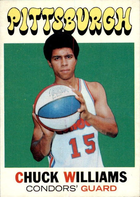
The Pittsburgh name at the top uses lettering reminiscent of the 1971-72 Topps Basketball set, although it's not as "mod" in appearance:


It's affixed to a fairly larger bit of illustration board which I've rotated ninety degrees for easier reading of the non-essential verbiage on the back:


I'm hopeful some more of these Clemente-styled mockups will be uncovered some day, I like the design!


Saturday, November 11, 2023

Come Sail Your Ships Around Me

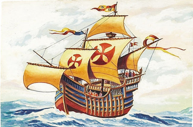
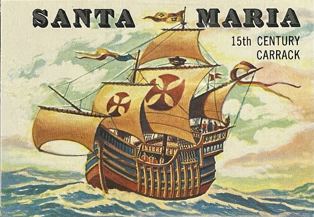
We're off to the high seas todays matey's, as we take a look at the waterborne portion of the 1955 Topps Rails and Sails set. As we all know, the style of paintings is a bit more in the tradition and style of nautical art and these more resemble pieces you might see in a museum or gallery, with full bleed borders aiding and abetting that look. As with the Rails, some Sails art has popped up over the years, here's one of the most famous subjects in the set, the SANTA MARIA:

As with the Rails, the level of details can be stunning.  Is that Cristopher Columbus near the bow?  Here's the finished card:


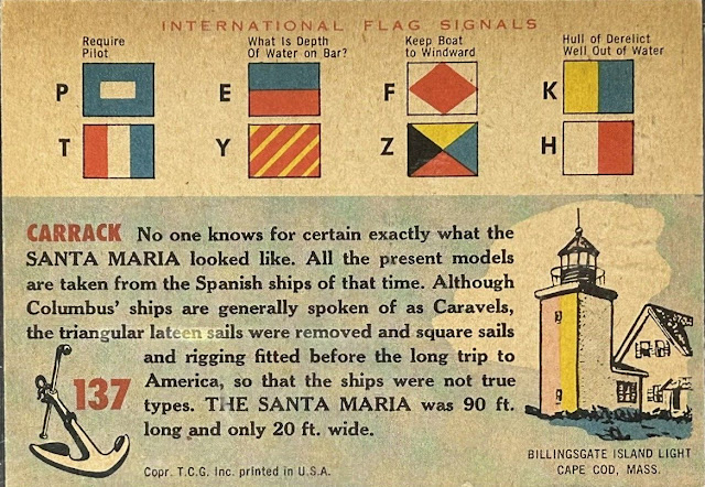
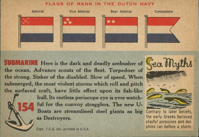
It's a little darker than the original as Topps essentially muted the brightness of the artwork in production.  The card back, to me at least, shows just how invested Topps was in the set, which was the last of their three great Giant Size transportation themed sets, namely Wings in 1952, World on Wheels in 1953-54 and then Rails and Sails in 1955. I can't prove it but suspect the latter two were designed as hopeful "Bowman killers" in a way.  Check it out:

There is a lot going on there! You get some useful information on flags used by vessels to communicate with each other at sea in the time before radio, a look at a lighthouse (the lighthouse tour was part of many of the Sails cards), some excellent text and a nice nautically-themed card number icon with an anchor and stock. Can you imagine taking on the open Atlantic in that tiny vessel during hurricane season?!

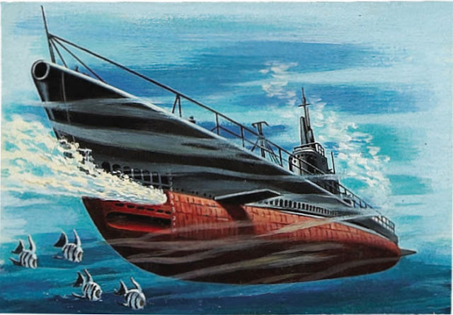
Here's another original illustration, it's subject is a bit more modern than the SANTA MARIA and that may reflect the fact it details a Submarine:

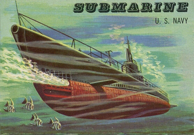
The muted color palette has been tossed out for the original illustration and it's kind of James Bond-like in a way, but almost ten years earlier that the movies. Hold on though, the printed version has had the color tamped down:


This one has some Dutch Navy details that don't follow the modern theme of the card (none of the illustrations in either Rails or Sails really matched the fronts) and a neat Sea Myth offers some weirdness:

There's even more to the set and I hope to get into that pretty soon sailors!

Saturday, November 4, 2023

Tell Me How Long The Train's Been Gone

On the heels of last week's Rails and Sails post, I thought I would share some artwork scans from the set. Despite the mismatch of styles for Rails versus Sails, I consider this set to be the apotheosis of the Topps Giant Size Non-Sports cards. The artwork on the front of the cards is often stunning, always well-executed and there is a wide range of subjects in both look and time.  Then there are the card backs, which were so well thought out and colorful for both modes of transportation.  I imagine it was was fairly time-consuming set to create and may have been a little expensive as well, although if it was, had more to do with the backs than the fronts I'd say.  The artwork was paid at per-the-piece rates of the day but some of the Rails copy (and/or possibly stock photographs used for the illustrations) came courtesy of American Car & Foundry and I suspect Topps may have had to pay for it.  Not all of the Rails cards carried  "Courtesy A.C.F. Industries Inc." indicia of course, some were from foreign railroads or, obviously, not manufactured by ACF.

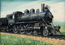
The original art has bubbled up in a few batches over the years, mostly around 15-18 years ago with some "finds" larger than others.  Today I want to ride the rails portion of the set and here's a great-looking original, which is the Casey Jones' Loco operated by the Illinois Central Railroad:


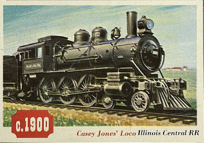
Here's the finished card:

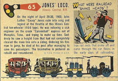
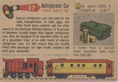
Sweet, right?  Here's the reverse where you can see what I mean about the design:


Beware of snake heads-yikes! And dig the rando locomotives and cars used for the main illustration running on the tracks along the bottom.

For the record, here's how the ACF indicia looked:


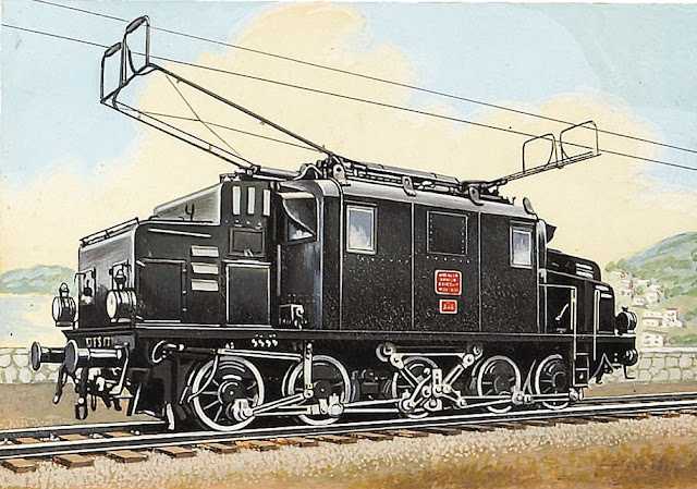
Here's a piece of art offered by Heritage sometime back, the level of detail is astounding:


Card no. 109 for those keeping score at home:


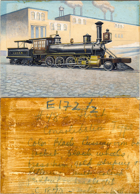
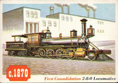
And here's a true production piece:


It's not no. 48 though, as marked, but rather no. 33:


The handwriting on the back seems to be instructing the illustrator on the various colors, indicating the source was a black and white photo; that's how things rolled back then!

Back with some Sails art next time kids!